 Log in


Hamburg, Germany

Today we are excited to announce the Release Candidate (RC) of TypeScript 6.0! To get started using the RC, you can get it through npm with the following command:
npm install -D typescript@rc
TypeScript 6.0 is a unique release in that we intend for it to be the last release based on the current JavaScript codebase. As announced last year (with recent updates here), we are working on a new codebase for the TypeScript compiler and language service written in Go that takes advantage of the speed of native code and shared-memory multi-threading. This new codebase will be the foundation of TypeScript 7.0 and beyond. TypeScript 6.0 will be the immediate precursor to that release, and in many ways it will act as the bridge between TypeScript 5.9 and 7.0. As such, most changes in TypeScript 6.0 are meant to help align and prepare for adopting TypeScript 7.0.
With that said, there are some new features and improvements that are not just about alignment. Let’s take a look at some of the highlights of this release, followed by a more detailed look at what’s changing for 7.0 and how to prepare for it.
What’s New Since the Beta?
Since TypeScript 6.0 beta, we have made a few noteworthy changes – mostly to align with the behavior of TypeScript 7.0.
One adjustment is in type-checking for function expressions in generic calls, especially those occurring in generic JSX expressions (see this pull request). This will typically catch more bugs in existing code, though you may find that some generic calls may need an explicit type argument.
We have also extended our deprecation of import assertion syntax (i.e. import ... assert {...}) to import() calls like import(..., { assert: {...}})
Finally, we have updated the DOM types to reflect the latest web standards, including some adjustments to the Temporal APIs as well.
Less Context-Sensitivity on this-less Functions
When parameters don’t have explicit types written out, TypeScript can usually infer them based on an expected type, or even through other arguments in the same function call.
declare function callIt<T>(obj: {
    produce: (x: number) => T,
    consume: (y: T) => void,
}): void;

// Works, no issues.
callIt({
    produce: (x: number) => x * 2,
    consume: y => y.toFixed(),
});

// Works, no issues even though the order of the properties is flipped.
callIt({
    consume: y => y.toFixed(),
    produce: (x: number) => x * 2,
});
Here, TypeScript can infer the type of y in the consume function based on the inferred T from the produce function, regardless of the order of the properties.
But what about if these functions were written using method syntax instead of arrow function syntax?
declare function callIt<T>(obj: {
    produce: (x: number) => T,
    consume: (y: T) => void,
}): void;

// Works fine, `x` is inferred to be a number.
callIt({
    produce(x: number) { return x * 2; },
    consume(y) { return y.toFixed(); },
});

callIt({
    consume(y) { return y.toFixed(); },
    //                  ~
    // error: 'y' is of type 'unknown'.

    produce(x: number) { return x * 2; },
});
Strangely enough, the second call to callIt results in an error because TypeScript is not able to infer the type of y in the consume method.
What’s happening here is that when TypeScript is trying to find candidates for T, it will first skip over functions whose parameters don’t have explicit types.
It does this because certain functions may need the inferred type of T to be correctly checked – in our case, we need to know the type of T to analyze our consume function.
These functions are called contextually sensitive functions – basically, functions that have parameters without explicit types. Eventually the type system will need to figure out types for these parameters – but this is a bit at odds with how inference works in generic functions because the two "pull" on types in different directions.
function callFunc<T>(callback: (x: T) => void, value: T) {
    return callback(value);
}

callFunc(x => x.toFixed(), 42);
//       ^
// We need to figure out the type of `x` here,
// but we also need to figure out the type of `T` to check the callback.
To solve this, TypeScript skips over contextually sensitive functions during type argument inference, and instead checks and infers from other arguments first.
If skipping over contextually sensitive functions doesn’t work, inference just continues across any unchecked arguments, going left-to-right in the argument list.
In the example immediately above, TypeScript will skip over the callback during inference for T, but will then look at the second argument, 42, and infer that T is number.
Then, when it comes back to check the callback, it will have a contextual type of (x: number) => void, which allows it to infer that x is a number as well.
So what’s going on in our earlier examples?
// Arrow syntax - no errors.
callIt({
    consume: y => y.toFixed(),
    produce: (x: number) => x * 2,
});

// Method syntax - errors!
callIt({
    consume(y) { return y.toFixed(); },
    //                  ~
    // error: 'y' is of type 'unknown'.

    produce(x: number) { return x * 2; },
});
In both examples, produce is assigned a function with an explicitly-typed x parameter.
Shouldn’t they be checked identically?
The issue is subtle: most functions (like the ones using method syntax) have an implicit this parameter, but arrow functions do not.
Any usage of this could require "pulling" on the type of T – for example, knowing the type of the containing object literal could in turn require the type of consume, which uses T.
But we’re not using this!
Sure, the function might have a this value at runtime, but it’s never used!
TypeScript 6.0 takes this into account when it decides if a function is contextually sensitive or not.
If this is never actually used in a function, then it is not considered contextually sensitive.
That means these functions will be seen as higher-priority when it comes to type inference, and all of our examples above now work!
This change was provided thanks to the work of Mateusz Burzyński.
Subpath Imports Starting with #/
When Node.js added support for modules, it added a feature called "subpath imports".
This is basically a field called imports which allows packages to create internal aliases for modules within their package.
{
    "name": "my-package",
    "type": "module",
    "imports": {
        "#root": "./dist/index.js",
        "#root/*": "./dist/*"
    }
}
This allows modules in my-package to import from #root instead of having to use a relative path like ../../index.js, and basically allows any other module to write something like
import * as utils from "#root/utils.js";
instead of using a relative path like the following.
import * as utils from "../../utils.js";
One minor annoyance with this feature has been that developers always had to write something after the # when specifying a subpath import.
Here, we used root, but it is a bit useless since there is no directory we’re mapping over other than ./dist/
Developers who have used bundlers are also accustomed to using path-mapping to avoid long relative paths.
A familiar convention with bundlers has been to use a simple @/ as the prefix.
Unfortunately, subpath imports could not start with #/ at all, leading to a lot of confusion for developers trying to adopt them in their projects.
But more recently, Node.js added support for subpath imports starting with #/.
This allows packages to use a simple #/ prefix for their subpath imports without needing to add an extra segment.
{
    "name": "my-package",
    "type": "module",
    "imports": {
        "#": "./dist/index.js",
        "#/*": "./dist/*"
    }
}
This is supported in newer Node.js 20 releases, and so TypeScript now supports it under the options node20, nodenext, and bundler for the --moduleResolution setting.
This work was done thanks to magic-akari, and the implementing pull request can be found here.
Combining --moduleResolution bundler with --module commonjs
TypeScript’s --moduleResolution bundler setting was previously only allowed to be used with --module esnext or --module preserve;
however, with the deprecation of --moduleResolution node (a.k.a. --moduleResolution node10), this new combination is often the most suitable upgrade path for many projects.
Projects will often want to instead plan out a migration towards either
--module preserveand--moduleResolution bundler--module nodenext
depending on your project type (e.g. bundled web app, Bun app, or Node.js app).
More information can be found at this implementing pull request.
The --stableTypeOrdering Flag
As part of our ongoing work on TypeScript’s native port, we’ve introduced a new flag called --stableTypeOrdering intended to assist with 6.0-to-7.0 migrations.
Today, TypeScript assigns type IDs (internal tracking numbers) to types in the order they are encountered, and uses these IDs to sort union types in a consistent manner. A similar process occurs for properties. As a result, the order in which things are declared in a program can have possibly surprising effects on things like declaration emit.
For example, consider the declaration emit from this file:
// Input: some-file.ts
export function foo(condition: boolean) {
    return condition ? 100 : 500;
}

// Output: some-file.d.ts
export declare function foo(condition: boolean): 100 | 500;
//                                               ^^^^^^^^^
//             Note the order of this union: 100, then 500.
If we add an unrelated const above foo, the declaration emit changes:
// Input: some-file.ts
const x = 500;
export function foo(condition: boolean) {
    return condition ? 100 : 500;
}

// Output: some-file.d.ts
export declare function foo(condition: boolean): 500 | 100;
//                                               ^^^^^^^^^
//                           Note the change in order here.
This happens because the literal type 500 gets a lower type ID than 100 because it was processed first when analyzing the const x declaration.
In very rare cases this change in ordering can even cause errors to appear or disappear based on program processing order, but in general, the main place you might notice this ordering is in the emitted declaration files, or in the way types are displayed in your editor.
One of the major architectural improvements in TypeScript 7 is parallel type checking, which dramatically improves overall check time.
However, parallelism introduces a challenge: when different type-checkers visit nodes, types, and symbols in different orders, the internal IDs assigned to these constructs become non-deterministic.
This in turn leads to confusing non-deterministic output, where two files with identical contents in the same program can produce different declaration files, or even calculate different errors when analyzing the same file.
To fix this, TypeScript 7.0 sorts its internal objects (e.g. types and symbols) according to a deterministic algorithm based on the content of the object.
This ensures that all checkers encounter the same object order regardless of how and when they were created.
As a consequence, in the given example, TypeScript 7 will always print 100 | 500, removing the ordering instability entirely.
This means that TypeScript 6 and 7 can and do sometimes display different ordering. While these ordering changes are almost always benign, if you’re comparing compiler outputs between runs (for example, checking emitted declaration files in 6.0 vs 7.0), these different orderings can produce a lot of noise that makes it difficult to assess correctness. Occasionally though, you may witness a change in ordering that causes a type error to appear or disappear, which can be even more confusing.
To help with this situation, in 6.0, you can specify the new --stableTypeOrdering flag.
This makes 6.0’s type ordering behavior match 7.0’s, reducing the number of differences between the two codebases.
Note that we don’t necessarily encourage using this flag all the time as it can add a substantial slowdown to type-checking (up to 25% depending on codebase).
If you encounter a type error using --stableTypeOrdering, this is typically due to inference differences.
The previous inference without --stableTypeOrdering happened to work based on the current ordering of types in your program.
To help with this, you’ll often benefit from providing an explicit type somewhere.
Often, this will be a type argument
- someFunctionCall(/*...*/);
+ someFunctionCall<SomeExplicitType>(/*...*/);
or a variable annotation for an argument you intend to pass into a call.
- const someVariable = { /*... some complex object ...*/ };
+ const someVariable: SomeExplicitType = { /*... some complex object ...*/ };

someFunctionCall(someVariable);
Note that this flag is only intended to help diagnose differences between 6.0 and 7.0 – it is not intended to be used as a long-term feature
See more at this pull-request.
es2025 option for target and lib
TypeScript 6.0 adds support for the es2025 option for both target and lib.
While there are no new JavaScript language features in ES2025, this new target adds new types for built-in APIs (e.g. RegExp.escape), and moves a few declarations from esnext into es2025 (e.g. Promise.try, Iterator methods, and Set methods).
Work to enable the new target was contributed thanks to Kenta Moriuchi.
New Types for Temporal
The long-awaited Temporal proposal has reached stage 3 and is expected to be added to JavaScript in the near future.
TypeScript 6.0 now includes built-in types for the Temporal API, so you can start using it in your TypeScript code today via --target esnext or "lib": ["esnext"] (or the more-granular temporal.esnext).
let yesterday = Temporal.Now.instant().subtract({
    hours: 24,
});

let tomorrow = Temporal.Now.instant().add({
    hours: 24,
});

console.log(`Yesterday: ${yesterday}`);
console.log(`Tomorrow: ${tomorrow}`);
Temporal is already usable in several runtimes, so you should be able to start experimenting with it soon. Documentation on the Temporal APIs is available on MDN, though it may still be incomplete.
This work was contributed thanks to GitHub user Renegade334.
New Types for "upsert" Methods (a.k.a. getOrInsert)
A common pattern with Maps is to check if a key exists, and if not, set and fetch a default value.
function processOptions(compilerOptions: Map<string, unknown>) {
    let strictValue: unknown;
    if (compilerOptions.has("strict")) {
        strictValue = compilerOptions.get("strict");
    }
    else {
        strictValue = true;
        compilerOptions.set("strict", strictValue);
    }
    // ...
}
This pattern can be tedious.
ECMAScript’s "upsert" proposal recently reached stage 4, and introduces 2 new methods on Map and WeakMap:
getOrInsertgetOrInsertComputed
These methods have been added to the esnext lib so that you can start using them immediately in TypeScript 6.0.
With getOrInsert, we can replace our code above with the following:
function processOptions(compilerOptions: Map<string, unknown>) {
    let strictValue = compilerOptions.getOrInsert("strict", true);
    // ...
}
getOrInsertComputed works similarly, but is for cases where the default value may be expensive to compute (e.g. requires lots of computations, allocations, or does long-running synchronous I/O).
Instead, it takes a callback that will only be called if the key is not already present.
someMap.getOrInsertComputed("someKey", () => {
    return computeSomeExpensiveValue(/*...*/);
});
This callback is also given the key as an argument, which can be useful for cases where the default value is based on the key.
someMap.getOrInsertComputed(someKey, computeSomeExpensiveDefaultValue);

function computeSomeExpensiveValue(key: string) {
    // ...
}
This update was contributed thanks to GitHub user Renegade334.
RegExp.escape
When constructing some literal string to match within a regular expression, it is important to escape special regular expression characters like *, +, ?, (, ), etc.
The RegExp Escaping ECMAScript proposal has reached stage 4, and introduces a new RegExp.escape function that takes care of this for you.
function matchWholeWord(word: string, text: string) {
    const escapedWord = RegExp.escape(word);
    const regex = new RegExp(`\\b${escapedWord}\\b`, "g");
    return text.match(regex);
}
RegExp.escape is available in the es2025 lib, so you can start using it in TypeScript 6.0 today.
This work was contributed thanks Kenta Moriuchi.
The dom lib Now Contains dom.iterable and dom.asynciterable
TypeScript’s lib option allows you to specify which global declarations your target runtime has.
One option is dom to represent web environments (i.e. browsers, who implement the DOM APIs).
Previously, the DOM APIs were partially split out into dom.iterable and dom.asynciterable for environments that didn’t support Iterables and AsyncIterables.
This meant that you had to explicitly add dom.iterable to use iteration methods on DOM collections like NodeList or HTMLCollection.
In TypeScript 6.0, the contents of lib.dom.iterable.d.ts and lib.dom.asynciterable.d.ts are fully included in lib.dom.d.ts.
You can still reference dom.iterable and dom.asynciterable in your configuration file’s "lib" array, but they are now just empty files.
// Before TypeScript 6.0, this required "lib": ["dom", "dom.iterable"]
// Now it works with just "lib": ["dom"]
for (const element of document.querySelectorAll("div")) {
    console.log(element.textContent);
}
This is a quality-of-life improvement that eliminates a common point of confusion, since no major modern browser lacks these capabilities.
If you were already including both dom and dom.iterable, you can now simplify to just dom.
See more at this issue and its corresponding pull request.
Breaking Changes and Deprecations in TypeScript 6.0
TypeScript 6.0 arrives as a significant transition release, designed to prepare developers for TypeScript 7.0, the upcoming native port of the TypeScript compiler. While TypeScript 6.0 maintains full compatibility with your existing TypeScript knowledge and continues to be API compatible with TypeScript 5.9, this release introduces a number of breaking changes and deprecations that reflect the evolving JavaScript ecosystem and set the stage for TypeScript 7.0.
In the two years since TypeScript 5.0, we’ve seen ongoing shifts in how developers write and ship JavaScript:
- Virtually every runtime environment is now "evergreen". True legacy environments (ES5) are vanishingly rare.
- Bundlers and ESM have become the most common module targets for new projects, though CommonJS remains a major target. AMD and other in-browser userland module systems are much rarer than they were in 2012.
- Almost all packages can be consumed through some module system. UMD packages still exist, but virtually no new code is available only as a global variable.
tsconfig.jsonis nearly universal as a configuration mechanism.- Appetite for "stricter" typing continues to grow.
- TypeScript build performance is top of mind. Despite the gains of TypeScript 7, performance must always remain a key goal, and options which can’t be supported in a performant way need to be more strongly justified.
So TypeScript 6.0 and 7.0 are designed with these realities in mind.
For TypeScript 6.0, these deprecations can be ignored by setting "ignoreDeprecations": "6.0" in your tsconfig; however, note that TypeScript 7.0 will not support any of these deprecated options.
Some necessary adjustments can be automatically performed with a codemod or tool.
For example, the experimental ts5to6 tool can automatically adjust baseUrl and rootDir across your codebase.
Up-Front Adjustments
We’ll cover specific adjustments below, but we have to note that some deprecations and behavior changes do not necessarily have an error message that directly points to the underlying issue. So we’ll note up-front that many projects will need to do at least one of the following:
-
Set the
"types"array in tsconfig, typically to"types": ["node"]."types": ["*"]will restore the 5.9 behavior, but we recommend using an explicit array to improve build performance and predictability.You’ll typically know this is the issue if you see a lot of type errors related to missing identifiers or unresolved built-in modules.
-
Set
"rootDir": "./src"if you were previously relying on this being inferredYou’ll often know this is the issue if you see files being written to
./dist/src/index.jsinstead of./dist/index.js.
Simple Default Changes
Several compiler options now have updated default values that better reflect modern development practices.
-
strictis nowtrueby default: The appetite for stricter typing continues to grow, and we’ve found that most new projects wantstrictmode enabled. If you were already using"strict": true, nothing changes for you. If you were relying on the previous default offalse, you’ll need to explicitly set"strict": falsein yourtsconfig.json. -
moduledefaults toesnext: Similarly, the new defaultmoduleisesnext, acknowledging that ESM is now the dominant module format. -
targetdefaults to current-year ES version: The new defaulttargetis the most recent supported ECMAScript spec version (effectively a floating target). Right now, that target ises2025. This reflects the reality that most developers are shipping to evergreen runtimes and don’t need to transpile down to older ECMAScript versions. -
noUncheckedSideEffectImportsis nowtrueby default: This helps catch issues with typos in side-effect-only imports. -
libReplacementis nowfalseby default: This flag previously incurred a large number of failed module resolutions for every run, which in turn increased the number of locations we needed to watch under--watchand editor scenarios. In a new project,libReplacementnever does anything until other explicit configuration takes place, so it makes sense to turn this off by default for the sake of better performance by default.
If these new defaults break your project, you can specify the previous values explicitly in your tsconfig.json.
rootDir now defaults to .
rootDir controls the directory structure of your output files relative to the output directory.
Previously, if you did not specify a rootDir, it was inferred based on the common directory of all non-declaration input files.
But this often meant that it was impossible to know if a file belonged to a project without trying to load and parse that project.
It also meant that TypeScript had to spend more time inferring that common source directory by analyzing every file path in the program.
In TypeScript 6.0, the default rootDir will always be the directory containing the tsconfig.json file.
rootDir will only be inferred when using tsc from the command line without a tsconfig.json file.
If you have source files any level deeper than your tsconfig.json directory and were relying on TypeScript to infer a common root directory for source files, you’ll need to explicitly set rootDir:
  {
      "compilerOptions": {
          // ...
+         "rootDir": "./src"
      },
      "include": ["./src"]
  }
Likewise, if your tsconfig.json referenced files outside of the containing tsconfig.json, you would need to adjust your rootDir to include those files.
  {
      "compilerOptions": {
          // ...
+         "rootDir": "../src"
      },
      "include": ["../src/**/*.tests.ts"]
  }
See more at the discussion here and the implementation here.
types now defaults to []
In a tsconfig.json, the types field of compilerOptions specifies a list of package names to be included in the global scope during compilation.
Typically, packages in node_modules are automatically included via imports in your source code;
but for convenience, TypeScript would also include all packages in node_modules/@types by default, so that you can get global declarations like process or the "fs" module from @types/node, or describe and it from @types/jest, without needing to import them directly.
In a sense, the types value previously defaulted to "enumerate everything in node_modules/@types".
This can be very expensive, as a normal repository setup these days might transitively pull in hundreds of @types packages, especially in multi-project workspaces with flattened node_modules.
Modern projects almost always need only @types/node, @types/jest, or a handful of other common global-affecting packages.
In TypeScript 6.0, the default types value will be [] (an empty array).
This change prevents projects from unintentionally pulling in hundreds or even thousands of unneeded declaration files at build time.
Many projects we’ve looked at have improved their build time anywhere from 20-50% just by setting types appropriately.
This will affect many projects. You will likely need to add "types": ["node"] or a few others:
  {
      "compilerOptions": {
          // Explicitly list the @types packages you need
+         "types": ["node", "jest"]
      }
  }
You can also specify a * entry to re-enable the old enumeration behavior:
  {
      "compilerOptions": {
          // Load ALL the types - the default from TypeScript 5.9 and before.
+         "types": ["*"]
      }
  }
If you end up with new error messages like the following:
Cannot find module '...' or its corresponding type declarations.
Cannot find name 'fs'. Do you need to install type definitions for node? Try `npm i --save-dev @types/node` and then add 'node' to the types field in your tsconfig.
Cannot find name 'path'. Do you need to install type definitions for node? Try `npm i --save-dev @types/node` and then add 'node' to the types field in your tsconfig.
Cannot find name 'process'. Do you need to install type definitions for node? Try `npm i --save-dev @types/node` and then add 'node' to the types field in your tsconfig.
Cannot find name 'Bun'. Do you need to install type definitions for Bun? Try `npm i --save-dev @types/bun` and then add 'bun' to the types field in your tsconfig.
Cannot find name 'describe'. Do you need to install type definitions for a test runner? Try `npm i --save-dev @types/jest` or `npm i --save-dev @types/mocha` and then add 'jest' or 'mocha' to the types field in your tsconfig.
it’s likely that you need to add some entries to your types field.
See more at the proposal here along with the implementing pull request here.
Deprecated: target: es5
The ECMAScript 5 target was important for a long time to support legacy browsers; but its successor, ECMAScript 2015 (ES6), was released over a decade ago, and all modern browsers have supported it for many years. With Internet Explorer’s retirement, and the universality of evergreen browsers, there are very few use cases for ES5 output today.
TypeScript’s lowest target will now be ES2015, and the target: es5 option is deprecated. If you were using target: es5, you’ll need to migrate to a newer target or use an external compiler.
If you still need ES5 output, we recommend using an external compiler to either directly compile your TypeScript source, or to post-process TypeScript’s outputs.
See more about this deprecation here along with its implementing pull request.
Deprecated: --downlevelIteration
--downlevelIteration only has effects on ES5 emit, and since --target es5 has been deprecated, --downlevelIteration no longer serves a purpose.
Subtly, using --downlevelIteration false with --target es2015 did not error in TypeScript 5.9 and earlier, even though it had no effect.
In TypeScript 6.0, setting --downlevelIteration at all will lead to a deprecation error.
Deprecated: --moduleResolution node (a.k.a. --moduleResolution node10)
--moduleResolution node encoded a specific version of Node.js’s module resolution algorithm that most-accurately reflected the behavior of Node.js 10.
Unfortunately, this target (and its name) ignores many updates to Node.js’s resolution algorithm that have occurred since then, and it is no longer a good representation of the behavior of modern Node.js versions.
In TypeScript 6.0, --moduleResolution node (specifically, --moduleResolution node10) is deprecated.
Users who were using --moduleResolution node should usually migrate to --moduleResolution nodenext if they plan on targeting Node.js directly, or --moduleResolution bundler if they plan on using a bundler or Bun.
See more at this issue and its corresponding pull request.
Deprecated: amd, umd, and systemjs values of module
The following flag values are no longer supported
--module amd--module umd--module systemjs--module none
AMD, UMD, and SystemJS were important during the early days of JavaScript modules when browsers lacked native module support. The semantics of "none" were never well-defined and often led to confusion. Today, ESM is universally supported in browsers and Node.js, and both import maps and bundlers have become favored ways for filling in the gaps. If you’re still targeting these module systems, consider migrating to an appropriate ECMAScript module-emitting target, adopt a bundler or different compiler, or stay on TypeScript 5.x until you can migrate.
This also implies dropped support for the amd-module directive, which will no longer have any effect.
See more at the proposal issue along with the implementing pull request.
Deprecated: --baseUrl
The baseUrl option is most-commonly used in conjunction with paths, and is typically used as a prefix for every value in paths.
Unfortunately, baseUrl is also considered a look-up root for module resolution.
For example, given the following tsconfig.json
{
  "compilerOptions": {
    // ...
    "baseUrl": "./src",
    "paths": {
      "@app/*": ["app/*"],
      "@lib/*": ["lib/*"]
    }
  }
}
and an import like
import * as someModule from "someModule.js";
TypeScript will probably resolve this to src/someModule.js, even if the developer only intended to add mappings for modules starting with @app/ and @lib/.
In the best case, this also often leads to "worse-looking" paths that bundlers would ignore; but it often meant that that many import paths that would never have worked at runtime are considered "just fine" by TypeScript.
path mappings have not required specifying baseUrl for a long time, and in practice, most projects that use baseUrl only use it as a prefix for their paths entries.
In TypeScript 6.0, baseUrl is deprecated and will no longer be considered a look-up root for module resolution.
Developers who used baseUrl as a prefix for path-mapping entries can simply remove baseUrl and add the prefix to their paths entries:
  {
    "compilerOptions": {
      // ...
-     "baseUrl": "./src",
      "paths": {
-       "@app/*": ["app/*"],
-       "@lib/*": ["lib/*"]
+       "@app/*": ["./src/app/*"],
+       "@lib/*": ["./src/lib/*"]
      }
    }
  }
Developers who actually did use baseUrl as a look-up root can also add an explicit path mapping to preserve the old behavior:
{
  "compilerOptions": {
    // ...
    "paths": {
      // A new catch-all that replaces the baseUrl:
      "*": ["./src/*"],

      // Every other path now has an explicit common prefix:
      "@app/*": ["./src/app/*"],
      "@lib/*": ["./src/lib/*"],
    }
  }
}
However, this is extremely rare.
We recommend most developers simply remove baseUrl and add the appropriate prefixes to their paths entries.
See more at this issue and the corresponding pull request.
Deprecated: --moduleResolution classic
The moduleResolution: classic setting has been removed.
The classic resolution strategy was TypeScript’s original module resolution algorithm, and predates Node.js’s resolution algorithm becoming a de facto standard.
Today, all practical use cases are served by nodenext or bundler.
If you were using classic, migrate to one of these modern resolution strategies.
See more at this issue and the implementing pull request.
Deprecated: --esModuleInterop false and --allowSyntheticDefaultImports false
The following settings can no longer be set to false:
esModuleInteropallowSyntheticDefaultImports
esModuleInterop and allowSyntheticDefaultImports were originally opt-in to avoid breaking existing projects.
However, the behavior they enable has been the recommended default for years.
Setting them to false often led to subtle runtime issues when consuming CommonJS modules from ESM.
In TypeScript 6.0, the safer interop behavior is always enabled.
If you have imports that rely on the old behavior, you may need to adjust them:
// Before (with esModuleInterop: false)
import * as express from "express";

// After (with esModuleInterop always enabled)
import express from "express";
See more at this issue and its implementing pull request.
Deprecated: --alwaysStrict false
The alwaysStrict flag refers to inference and emit of the "use strict"; directive.
In TypeScript 6.0, all code will be assumed to be in JavaScript strict mode, which is a set of JS semantics that most-noticeably affects syntactic corner cases around reserved words.
If you have "sloppy mode" code that uses reserved words like await, static, private, or public as regular identifiers, you’ll need to rename them.
If you relied on subtle semantics around the meaning of this in non-strict code, you may need to adjust your code as well.
See more at this issue and its corresponding pull request.
Deprecated: outFile
The --outFile option has been removed from TypeScript 6.0. This option was originally designed to concatenate multiple input files into a single output file. However, external bundlers like Webpack, Rollup, esbuild, Vite, Parcel, and others now do this job faster, better, and with far more configurability. Removing this option simplifies the implementation and allows us to focus on what TypeScript does best: type-checking and declaration emit. If you’re currently using --outFile, you’ll need to migrate to an external bundler. Most modern bundlers have excellent TypeScript support out of the box.
Deprecated: legacy module Syntax for namespaces
Early versions of TypeScript used the module keyword to declare namespaces:
// ❌ Deprecated syntax - now an error
module Foo {
    export const bar = 10;
}
This syntax was later aliased to the modern preferred form using the namespace keyword:
// ✅ The correct syntax
namespace Foo {
    export const bar = 10;
}
When namespace was introduced, the module syntax was simply discouraged.
A few years ago, the TypeScript language service started marking the keyword as deprecated, suggesting namespace in its place.
In TypeScript 6.0, using module where namespace is expected is now a hard deprecation.
This change is necessary because module blocks are a potential ECMAScript proposal that would conflict with the legacy TypeScript syntax.
The ambient module declaration form remains fully supported:
// ✅ Still works perfectly
declare module "some-module" {
    export function doSomething(): void;
}
See this issue and its corresponding pull request for more details.
Deprecated: asserts Keyword on Imports
The asserts keyword was proposed to the JavaScript language via the import assertions proposal;
however, the proposal eventually morphed into the import attributes proposal, which uses the with keyword instead of asserts.
Thus, the asserts syntax is now deprecated in TypeScript 6.0, and using it will lead to an error:
// ❌ Deprecated syntax - now an error.
import blob from "./blahb.json" asserts { type: "json" }
//                              ~~~~~~~
// error: Import assertions have been replaced by import attributes. Use 'with' instead of 'asserts'.
Instead, use the with syntax for import attributes:
// ✅ Works with the new import attributes syntax.
import blob from "./blahb.json" with { type: "json" }
See more at this issue and its corresponding pull request.
Deprecated: no-default-lib Directives
The /// <reference no-default-lib="true"/> directive has been largely misunderstood and misused.
In TypeScript 6.0, this directive is no longer supported.
If you were using it, consider using --noLib or --libReplacement instead.
See more here and at the corresponding pull request.
Specifying Command-Line Files When tsconfig.json Exists is Now an Error
Currently, if you run tsc foo.ts in a folder where a tsconfig.json exists, the config file is completely ignored.
This was often very confusing if you expected checking and emit options to apply to the input file.
In TypeScript 6.0, if you run tsc with file arguments in a directory containing a tsconfig.json, an error will be issued to make this behavior explicit:
error TS5112: tsconfig.json is present but will not be loaded if files are specified on commandline. Use '--ignoreConfig' to skip this error.
If it is the case that you wanted to ignore the tsconfig.json and just compile foo.ts with TypeScript’s defaults, you can use the new --ignoreConfig flag.
tsc --ignoreConfig foo.ts
See more at this issue and its corresponding pull request.
Preparing for TypeScript 7.0
TypeScript 6.0 is designed as a transition release.
While options deprecated in TypeScript 6.0 will continue to work without errors when "ignoreDeprecations": "6.0" is set, those options will be removed entirely in TypeScript 7.0 (the native TypeScript port).
If you’re seeing deprecation warnings after upgrading to TypeScript 6.0, we strongly recommend addressing them before adopting TypeScript 7.0 (or trying native previews) in your project.
As for the schedule, we expect TypeScript 7.0 to follow soon after TypeScript 6.0. This should help us maintain continuity while giving us a faster feedback loop for migration issues discovered during adoption.
What’s Next?
At this point, TypeScript 6.0 is feature-complete, and we anticipate very few changes apart from critical bug fixes to the compiler. Over the next few weeks, we’ll focus on addressing issues reported on the 6.0 branch, so we encourage you to try the RC and share feedback.
We also publish nightly builds on npm and in Visual Studio Code, which can provide a faster snapshot of recently fixed issues.
We are also continuing to work on TypeScript 7.0, and we publish nightly builds of our native previews along with a VS Code extension too. Feedback on both 6.0 and 7.0 are very much appreciated, and we encourage you to try out both if you can.
So give TypeScript 6.0 RC a try in your project, and let us know what you think!
Happy Hacking!
– Daniel Rosenwasser and the TypeScript Team
The post Announcing TypeScript 6.0 RC appeared first on TypeScript.
Hamburg, Germany

Pennsylvania, USA
Every interface I've ever used that felt right had something in common, they always respect how I actually think. Not how a spec says I should think, but how my brain actually works. Deeper reasearch revels that there's a bunch of psychology behind this.
Researchers have been studying it for decades. In this post, I'm not going to cover all of it, just the laws I find myself coming back to the most and find the most useful to keep in mind when building interfaces.
Fitts's Law
The time required to move to a target is a function of the target's size and distance from the starting point.1
The bigger something is, the easier it is to click. This one is pretty obvious, but it's something that's easy to overlook when building.
Fitts's Law ExperimentThe experiment above should prove the above statement. It's pretty easy to hit something that's larger. But when you're dealing with small targets, you need to be more precise. This matters a lot when you're building. Always think about the hit area of your interactive elements.
Above I'm using ::before to expand the hit area of a button. The user can't see the extra padding, but it's there and it's easy to click. Every pixel of padding on a button is a usability decision. Make the things people need to click easy to click.
Sidenote, this concept can also be seen somewhat in games. In platformers, there's a trick called "coyote time" where the game lets you jump for a few frames after you've already walked off a ledge. You're technically in the air, but the game pretends you're still on solid ground.
Coyote Time - Celeste2Same principle as expanding a button's hit area. Instead of making a spatial target bigger, you're making a temporal target bigger. The user doesn't notice the forgiveness. They just feel like the system works.
Hick's Law
The time it takes to make a decision increases with the number and complexity of choices.3
More options, more cognitive load. And it's not linear, it's logarithmic. Going from 2 to 4 choices is noticeable. Going from 8 to 16 is painful.
Hick's Law ExperimentFinding a word among 4 options is easy. Now try it with 24, each printed in the wrong color. That hesitation you feel is Hick's Law.
This doesn't mean you should always minimize choices. Sometimes people need options. The key is progressive disclosure. Show what matters now, reveal complexity when it's needed.
Restaurant menus understand this intuitively. The best ones don't list 200 dishes. They curate what you think should be seen. Your interface should too.
Miller's Law
The average person can hold about 7 (plus or minus 2) items in working memory at any given time.4
Whenever you're dealing with a lot of data, you need to chunk it or group it in a way that makes sense to the user. Showing them blobs of text is the worst thing you can do. It's like trying to find a needle in a haystack of junk.
Phone
Card
Social
Serial
Currency
The raw data is identical to the chunked version. Your brain processes them completely differently. Chunking isn't a nice-to-have, I think it's a cognitive necessity.
Doherty Threshold
Productivity soars when a computer and its users interact at a pace that ensures neither has to wait on the other. The threshold is 400 milliseconds.5
Under 400ms, interactions feel instant. Above it, you notice. Way above it, you start wondering if something broke.
Instant (<100ms)
Threshold (<400ms)
Broken (>2000ms)
The 100ms response feels like the button is an extension of your hand. 400ms is barely noticeable. 2000ms feels broken, even though it does exactly the same thing.
If you can't make something fast, make it feel fast. Optimistic UI, skeleton screens, progress indicators, they all exist because perceived speed matters as much as actual speed. The best interactions are the ones where you never think about speed at all.
Postel's Law
Be conservative in what you send, be liberal in what you accept.6
This was originally a networking principle from RFC 761, but it translates perfectly to interface design. Your inputs should accept messy human data and normalize it into clean output.
Try entering dates in any format.Users don't think in formats. They think in meaning. When someone types "jan 15 2024" they mean the same thing as "2024-01-15". Your interface should understand that.
The more formats you accept, the less friction people experience. Validate generously, format strictly.
Looking Back
I keep coming back to these laws because they're not really about interfaces. They're about how people work. How we perceive time, how we make decisions, how much we can hold in our heads at once.
You don't need to memorize any of this. Just pay attention to how things feel when you use them. At the end of the day, the hardest thing to do is make something feel easy, and that's what were trying to achieve.
If you want to dive deeper into all of this, check out Laws of UX by Jon Yablonski. It covers way more than what I've touched on here.
-
Fitts, P. M. (1954). The information capacity of the human motor system in controlling the amplitude of movement. Journal of Experimental Psychology, 47(6), 381-391. ↩
-
Game Maker's Toolkit, Why Does Celeste Feel So Good to Play?. Full video covering Celeste's controls, animation, and forgiveness mechanics. ↩
-
Hick, W. E. (1952). On the rate of gain of information. Quarterly Journal of Experimental Psychology, 4(1), 11-26. ↩
-
Miller, G. A. (1956). The magical number seven, plus or minus two. Psychological Review, 63(2), 81-97. ↩
-
Doherty, W. J., & Kelisky, R. P. (1979). Managing VM/CMS systems for user effectiveness. IBM Systems Journal, 18(1), 143-163. ↩
-
Jon Postel's original principle from RFC 761, applied to interface design. See also Postel's Law on Laws of UX. ↩
Hamburg, Germany
Tooltips feel like the smallest UI problem you can have. They’re tiny and usually hidden. When someone asks how to build one, the traditional answer almost always comes back using some JavaScript library. And for a long time, that was the sensible advice.
I followed it, too.
On the surface, a tooltip is simple. Hover or focus on an element, show a little box with some text, then hide it when the user moves away. But once you ship one to real users, the edges start to show. Keyboard users Tab into the trigger, but never see the tooltip. Screen readers announce it twice, or not at all. The tooltip flickers when you move the mouse too quickly. It overlaps content on smaller screens. Pressing Esc does not close it. Focus gets lost.
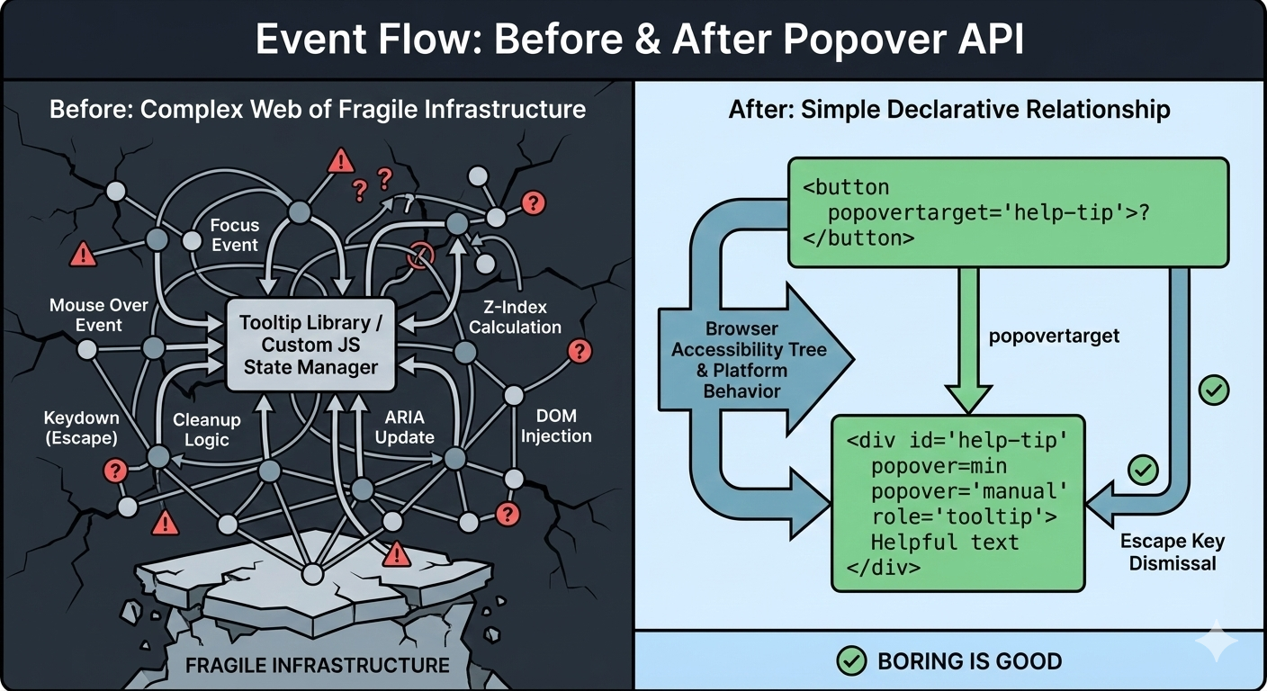
Over time, my tooltip code grew into something I didn’t really want to own anymore. Event listeners piled up. Hover and focus had to be handled separately. Outside clicks needed special cases. ARIA attributes had to be kept in sync by hand. Every small fix added another layer of logic.
Libraries helped, but they were also more like black boxes I worked around instead of fully understanding what was happening behind the scenes.
That was what pushed me to look at the newer Popover API. I wanted to see what would happen if I rebuilt a single tooltip using the browser’s native model without the aid of a library.
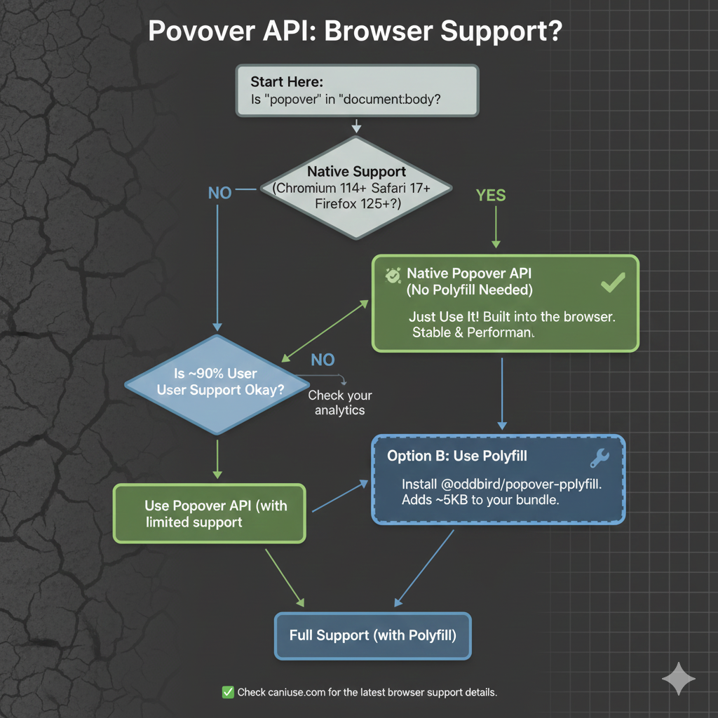
As we start, it’s worth noting that, as with any new feature, there are some things with it that are still being ironed out. That said, it currently enjoys great browser support, although there are several pieces to the overall API that are in flux. It’s worth keeping an eye on Caniuse in the meantime.
The “Old” TooltipBefore the Popover API, using a tooltip library was not a shortcut. It was the default. Browsers didn’t have a native concept of a tooltip that worked across mouse, keyboard, and assistive technology. If you cared about correctness, your only option was to use a library, and that is exactly what I did.
At a high level, the pattern was always the same: a trigger element, a hidden tooltip element, and JavaScript to coordinate the two.
<button class="info">?</button>
<div class="tooltip" role="tooltip">Helpful text</div>
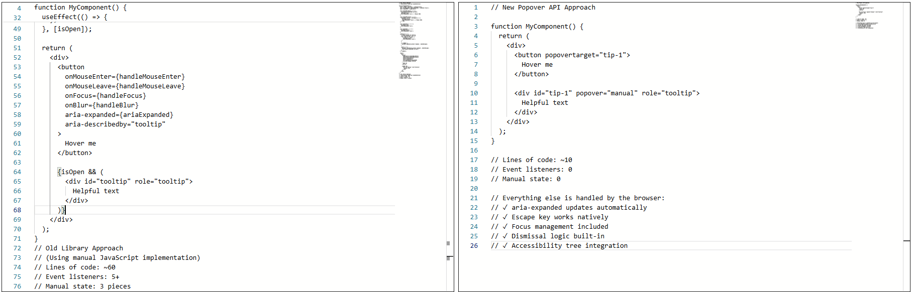
The library handled the wiring that allowed the element to show on hover or focus, hide on blur or mouse leave, and reposition/resize on scroll.
Over time, the tooltip could become fragile. Small changes carried risk. Minor fixes caused regressions. Worse, adding new tooltips inherited the same complexity. Things technically worked, but never felt settled or complete.
That was the state of things when I decided to rebuild the tooltip using the browser’s native Popover API.
The Moment I Tried The Popover APII didn’t switch to using the Popover API because I wanted to experiment with something new. I switched because I was tired of maintaining tooltip behavior that I believed the browser should have already understood.
I was skeptical at first. Most new web APIs promise simplicity, but still require glue, edge-case handling, or fallback logic that quietly recreates the same complexity that you were trying to escape.
So, I tried the Popover API in the smallest way possible. Here’s what that looked like:
<!-- popovertarget creates the connection to id="tip-1" -->
<button popovertarget="tip-1">?</button>

<!-- popover="manual": browser manages this as a popover -->
<!-- role="tooltip": tells assistive technology what this is -->
<div id="tip-1" popover="manual" role="tooltip">
  This button triggers a helpful tip.
</div>
1. The Keyboard “Just Works”
Keyboard support depended on multiple layers lining up correctly: focus had to trigger the tooltip, blur had to hide it, Esc had to be wired manually, and timing mattered. If you missed one edge case, the tooltip would either stay open too long or disappear before it could be read.
With the popover attribute set to auto or manual, the browser takes over the basics: Tab and Shift+Tab behave normally, Esc closes the tooltip every time, and no extra listeners are required.
<div popover="manual">
  Helpful explanation
</div>
What disappeared from my codebase were global keydown handlers, Esc-specific cleanup logic, and state checks during keyboard navigation. The keyboard experience stopped being something I had to maintain, and it became a browser guarantee.
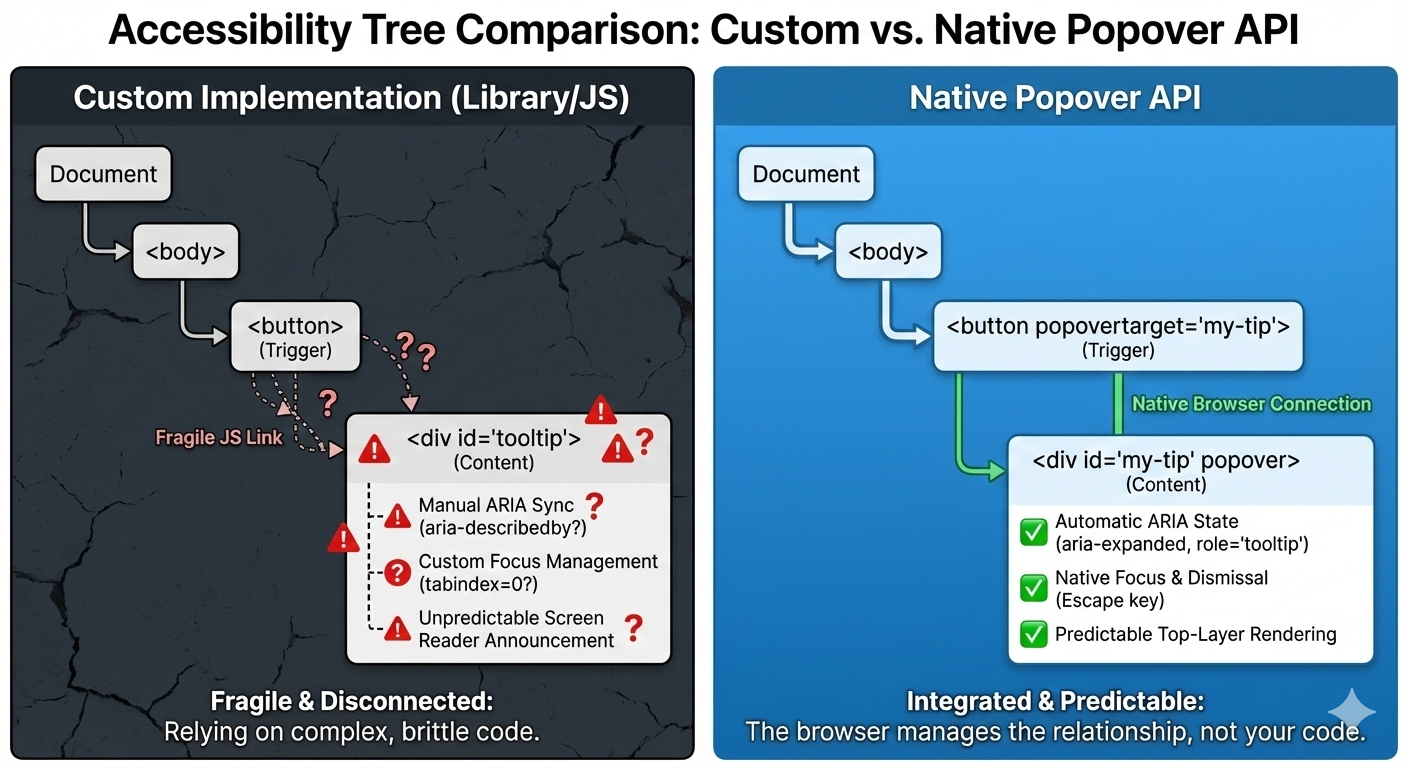
2. Screenreader Predictability
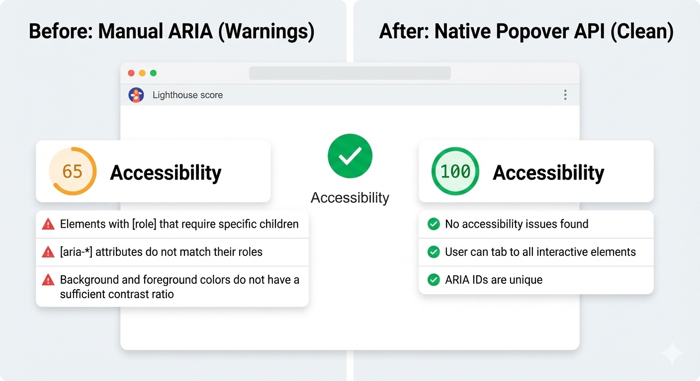
This was the biggest improvement. Even with careful ARIA work, the behavior varied, as I outlined earlier. Every small change felt risky. Using a popover with a proper role looks and feels a lot more stable and predictable as far as what’s going to happen:
<div popover="manual" role="tooltip">
  Helpful explanation
</div>
And here’s another win: After the switch, Lighthouse stopped flagging incorrect ARIA state warnings for the interaction, largely because there are no longer custom ARIA states for me to accidentally get wrong.
3. Focus Management
Focus used to be fragile. Before, I had rules like: let focus trigger show tooltip, move focus into tooltip and don’t close, blur trigger when it’s too close, and close tooltip and restore focus manually. This worked until it didn’t.
With the Popover API, the browser enforces a simpler model where focus can more naturally move into the popover. Closing the popover returns focus to the trigger, and there are no invisible focus traps or lost focus moments. And I didn’t add focus restoration code; I removed it.
The Popover API means that tooltips are no longer something you simulate. They’re something the browser understands. Opening, closing, keyboard behavior, Escape handling, and a big chunk of accessibility now come from the platform itself, not from ad-hoc JavaScript.
That does not mean tooltip libraries are obsolete because they still make sense for complex design systems, heavy customization, or legacy constraints, but the default has shifted. For the first time, the simplest tooltip can also be the most correct one. If you are curious, try this experiment: Simply replace just one tooltip in your product with the Popover API, do not rewrite everything, do not migrate a whole system, and just pick one and see what disappears from your code.
When the platform gives you a better primitive, the win is not just fewer lines of JavaScript, but it is fewer things you have to worry about at all.
Check out the full source code in my GitHub repo.
Further Reading
For deeper dives into popovers and related APIs:
- “Poppin’ In”, Geoff Graham
- “Clarifying the Relationship Between Popovers and Dialogs”, Zell Liew
- “What is popover=hint?”, Una Kravets
- “Invoker Commands”, Daniel Schwarz
- “Creating an Auto-Closing Notification with an HTML Popover”, Preethi
- Open UI Popover API Explainer
- “Pop(over) the Balloons”, John Rhea
- “CSS Anchor Positioning”, Juan Diego Rodríguez
MDN also offers comprehensive technical documentation for the Popover API.
Pennsylvania, USA
Hamburg, Germany
I’m currently looking for a job, so I have some free time. I decided to use it to work on the look and feel of this website some more, adding small design touches for a nicer, more accessible reading experience. I’ll share the highlights in this article!
- Working theme switcher
- Fluid typography
- Creative embeds
- Heading anchors
- Fleurons
- Squircle corners
- Clearer focus styles
- Better ad placement
- Wrapping up
Working theme switcher
There were a few minor issues with the theme switcher (in the corner of your screen).
- For starters, it didn’t work when the operating system was set to dark mode. The website would be correctly rendered in dark mode, but the theme switcher would simply not work.
- Also Giscus (my comment system) wouldn’t adapt to the theme, so you’d have a bright section when using dark mode.
I’ve reworked theme-related code a lot. On the CSS side, I’ve leveraged the color-scheme property, and started using the light-dark(..) function pretty much all over the place.
:root {
  color-scheme: light dark;
}

body {
  color: light-dark(#444, #eee);
  background-color: light-dark(#fff, #222);
}
I’ve improved the control itself to be a tri-state button to support dark, light and automatic modes. I wasn’t super sure what would be the best markup for this, so I decided to leverage the mixed state from aria-pressed.
<!-- Button currently in light mode -->
<button
  type="button"
  aria-pressed="false"
  class="ThemeButton no-print"
  title="Theme: light"
>
  <span class="visually-hidden">Dark mode</span>
  <!-- Appropriate icon for current mode here -->
</button>
Semantically, this is a button to control the dark mode specifically (not exactly the theme per se). The aria-pressed attribute determines whether the dark mode is enabled: true for yes, false for no, mixed for automatic (according to the operating system preference).
The JavaScript code just rotates between the 3 states, and backs up the preference in the local storage of the browser. When you interact with the button, it computes the next state, updates the aria-pressed and title attributes, and stores the new value in local storage.
I’ve also added a playful little hover animation for that button, making it wiggle. Try it here:
.ThemeButton:hover {
  animation: wiggle 500ms ease-out;
}

@keyframes wiggle {
  from { transform: rotate(10deg) }
  25% { transform: rotate(-10deg) }
  50% { transform: rotate(20deg) }
  75% { transform: rotate(-5deg) }
  to { transform: rotate(0deg) }
}
Fluid typography
Fluid typography is not new. Geoff Graham, among others, was already writing about it in 2017. Somehow, I never really bothered to look into it. I always found it to be an unnecessary trick. But I decided to come back to it and actually try it out, since this seems like the right place for that.
I’m not smart enough to really make sense of the math behind it, but this declaration essentially allows for variable font size between 1.25rem and 1.4rem. CSS-Tricks has a good article about fluid typography to dive deep into the concept.
body {
  font-size: min(max(1.25rem, 4vw), 1.4rem);
}
Creative embeds
Historically, blockquotes and informative callouts were rendered exactly the same on this website. This came from a time where I used to write content in pure Markdown with no HTML access, and used the blockquote syntax (>) to create callouts. It’s of course not great for semantics, so I eventually had 2 different components, and it was time to style them differently.
Let’s see them in action:
This is a blockquote. It is meant to represent a citation — from someone or somewhere, and renders a
<blockquote>element.
— Kitty Giraudel
And:
They still do look similar! They bear the same pale blue background color, and the blue to pink gradient border. Speaking of which, for some reason it does not seem to be possible to render a gradient border using border-image with rounded corners. I have resorted to using this solution from StackOverflow:
blockquote {
  --background-color: light-dark(#f3f8fc, #303132);
  padding: 0.75em 1.5em;
  background-color: var(--background-color);
  border: 2px solid transparent;
  background-image:
    linear-gradient(var(--background-color), var(--background-color)),
    linear-gradient(to right, var(--blue), var(--pink));
  background-origin: border-box;
  background-clip: padding-box, border-box;
}
It’s a very clever approach: it uses a flat gradient (with no color change) applied all the way through the padding box, and the actual gradient applied to the border box, created by a transparent border.
Now, for the floating typographic marks, I’ve used absolutely positioned pseudo-elements: a curious interrobang for callouts, and curly quotation marks for blockquotes. For instance, here is the code for the callout:
.Info::before {
  content: '‽';

  opacity: 0.2;
  font: 1000% / 1 Baskerville, serif;
  color: var(--blue);

  position: absolute;
  bottom: 100%;
  left: 0;
  z-index: 1;

  transform: translate(-10%, 69%) rotate(-30deg);
}
It’s worth pointing out that the transform value for the pseudo-element is totally arbitrary. I just played with the values until I reached something I was happy with. It would need different values for a different font family or size.
To ensure the content within the callout sits on top of the decorative character (even though the latter is semi-transparent), we bump its z-index:
.Info > * { position: relative; z-index: 2; }I have used the same design pattern for footnotes, and the editorial changes for an example). I really like the juxtaposition of a neatly bordered box, and a decorative element breaking out of it, bringing some dynamism!
Heading anchors
I have had a love-hate relationship with heading anchors over the years. I’ve had them, removed them, had them again, removed them again. Well guess what? They’re back! I was seduced by Zach Leat’s elegant heading-anchors web component. It’s very light, accessible, and easy to use.
<heading-anchors selector="h2,h3,h4" content="§">
  <!-- Page content -->
</heading-anchors>
Fleurons
I am fascinated by obscure typographic features. One of my recent reads is Shady Characters by Keith Houston — a fabulous walk through a dozen or so typographic characters, such as &, and #, and †.
The other day, I stumbled upon this delightful website by Henry Desroches. Just before the footer stands this gorgeous little guy: ❦. Would you just look at it? It turns out that it has a name: the fleuron. Quoting Wikipedia:
A fleuron (/ˈflʊərɒn, -ən, ˈflɜːrɒn, -ən/), also known as a printers’ flower, is a typographical symbol, or glyph, used either as a punctuation mark or as an ornament for typographic compositions. Fleurons are stylized forms of flowers or leaves; the term derives from the Old French: floron (“flower”). Robert Bringhurst in The Elements of Typographic Style calls the forms “horticultural dingbats”. A commonly encountered fleuron is the ❦, the floral heart or hedera (ivy leaf), also known as an aldus leaf after Italian Renaissance printer Aldus Manutius.
I couldn’t resist inserting this “horticultural dingbat” in a few places, least of all between the post date and the expected reading time in the header of the article layout. Another tiny flourish that makes the layout feel more considered.
❦ 6–minute read
Squircle corners
I have recently (re)discovered squircle corners, and the fact that they are getting native support in CSS via the corner-shape property.
.box {
  border-radius: 1em;
  corner-shape: squircle;
}
I’ve switched most boxes to use squircle corners because I find them more aesthetically pleasing. So code blocks, blockquotes, callouts, outlines and more now use this new shape (provided your browser supports it).
Clearer focus styles
I’ve had these gradient links for a long time now. And I still like them a lot, but the effect can be quite subtle, especially on low resolution screens. So I’ve decided to make the focus styles more obvious by adding a proper pink outline:
a:focus-visible {
  outline: 2px solid var(--pink);
  outline-offset: 2px;
  border-radius: 0.25em;
  corner-shape: squircle;
}
Speaking of links, I’ve also added a little bit of spacing at the top of the page when linking to a heading so that it doesn’t lick the top of the window.
h2 {
  scroll-margin-top: 0.5rem;
}
Better ad placement
For some reason, I am still running ads on this website. It’s not like I make a lot of money from it though. I’ve been with CarbonAds for over 10 years, and probably haven’t made more than a few hundred bucks from them in all that time. But still, it pays for the occasional cup of coffee, so it’s kind of nice I guess.
Carbon requires the ad (which is ~330 × 114px) to be placed above the fold — for obvious reasons. I didn’t really know what to do with it, so I had placed it right below the title, centered. It didn’t look too great. Even worse, when running an ad-blocker (something I obviously also do), there would be this massive blank space under the page title for where the ad was supposed to show up. It would look awkward.
I had limited that problem a little by placing the ad in the bottom right corner of the screen for large viewports. But that wouldn’t happen before 1556-pixel-wide viewports.
So I’ve implemented a few changes. First, I’ve moved the ad a little lower in the page, while still living above the fold. When possible, I injected it after the first paragraph. This wasn’t too obvious in Liquid:
{% assign parts = content | split: "</p>" %}
{{ parts | first }}</p>
{% include "ad.html" %}
{% for part in parts offset: 1 %}
{{ part }}{% unless forloop.last %}</p>{% endunless %}
{% endfor %}And for it to fit better within the flow of the article, I’ve wrapped the ad in a visible container, with a dedicated slot and some text to explicitly mention that this callout is for an ad display.
Finally, I’ve made it so that if the ad couldn’t be loaded (because of an ad-blocker or any other reason), the ad container would be hidden entirely:
.Ad:not(:has(#carbonads)) { display: none }

@media screen and (min-width: 1556px) {
  .Ad          { display: contents }
  .Ad__text    { display: none }
  .Ad__carbon  { position: fixed; bottom: 0.5em; right: 1em }
}
Wrapping up
I think I covered the most important things! I’ve also cleaned up a lot of the code, particularly on the CSS side, but it’s not particularly interesting. Overall, I’m very happy with the design, and it’s been very fulfilling getting to work on it calmly and peacefully. I hope you like it!
Hamburg, Germany
Published on
Creating non-standard shapes on the web, like a speech bubble or a heart have typically required you to cut off your actual borders with clip-path. More recently, corner-shape landed in Chrome, which gives us more options for styling how a corner looks, but is still quite limited.
This is where
border-shapecomes in. It’s a powerful upcoming CSS primitive that defines a custom shape for an element’s border.
border-shape is currently available for testing in Chrome Canary 146+ with the experimental web platform features flag turned on. Part of the CSS Borders and Box Decorations Module Level 4, this property allows developers to define the geometry of an element’s border using the same flexible syntax we use for paths and shape().
All about border-shape #
Unlike clip-path, which simply masks an element, border-shape actually redefines the “box” itself. When you apply a shape to a border, the background, the border-image, focus outline, and the box-shadow all follow that new geometry.
The property accepts several values, including:
- Basic Shapes:
circle(),ellipse(),inset(), andpolygon(). - The
shape()function: A powerful new way to draw complex paths directly in CSS (in Chrome and a part of Interop 2026) - Path Strings: Similar to SVG path data (e.g.,
path("M 10 10 L 90 10 ...")).
border-shape vs. corner-shape #
While both are new and live within the same Level 4 specification, border-shape and corner-shape serve two different architectural purposes.
corner-shape doesn’t extend beyond corner styling, so you couldn’t have a cut-out or extrusion in the middle-bottom of your element, or create non-normative shapes like a star. It’s great when you want to adjust the corners to some simple, browser-provided shapes, but for more complex shapes, you’ll want to reach for border-shape.
I built a little tool to help you quickly play with it:
The first thought that came to mind when I saw this API was “Amazing! we can finally do tooltips—for real!” This is a big deal! (That was not AI generated, I use em dashes my friends. I studied typography in college).
Previously, to create tooltips in CSS, you had to either cut off the edges of a div using clip-path or use the triangle hack with pseudo elements. Both have their downsides.
In this demo, I’m building a tooltip around the border using the arrow position, height, and width. It also includes the border radius in the calculation (optional). Play with the values to build your own tooltip and copy the code, with a clip-path fallback. This is why on unsupported devices, you will see the border cut off on the bottom of the tooltip. With border-shape supported, borders and shadows work as expected.
First set the variables:
--r: 10px;  /* Corner Radius */
--ap: 50%;  /* Arrow Position */
--ah: 10px; /* Arrow Height */
--aw: 10px; /* Arrow Width (Half) */
Then create the border-shape shape():
border-shape: shape(from var(--r) 0,
  hline to calc(100% - var(--r)),
  curve to right var(--r) with right top,
  vline to calc(100% - (var(--r) + var(--ah))),
  curve to calc(100% - var(--r)) calc(100% - var(--ah)) with right calc(100% - var(--ah)),
  hline to calc(var(--ap) + var(--aw)),
  line by calc(var(--aw) * -1) var(--ah),
  line by calc(var(--aw) * -1) calc(var(--ah) * -1),
  hline to var(--r),
  curve to left calc(100% - (var(--r) + var(--ah))) with left calc(100% - var(--ah)),
  vline to var(--r),
  curve to var(--r) top with left top);
}
Now you can take this and put it into action, like in this tooltip demo, which animates the border-shape based on its anchor position using anchored container queries:
Chevron nav demo #
See demo on Codepen.This one looks a little simpler. To “type-read” this out: starting from the top-left, move to the end of the div clockwise (less the arrow size, because we then need to start drawing out to the arrow point). Then, draw a line to the center right point. Then, draw a line back to the bottom at 100% of the element less the arrow-size. Again, move all the way to the left. Finally, draw a line inward to the center at the width of the arrow size, and close it.
border-shape: shape(
  from top left,
  hline to calc(100% - var(--arrow-size)),
  line to right center,
  line to calc(100% - var(--arrow-size)) bottom,
  hline to left,
  line to var(--arrow-size) center,
  close
);
The first element has a slight adjustment where I just removed the line before the close instead of adding the inset chevron of the last step above.
border-shape: shape(
  from top left,
  hline to calc(100% - var(--arrow-size)),
  line to right center,
  line to calc(100% - var(--arrow-size)) bottom,
  hline to left,
  close
);
This demo is really neat because you can add a gap and really see how this works. No need to mess with z-index, no layering, and borders/outlines will follow the border-shape perfectly. Just real geometry. Pretty cool!
Scalloped Borders #
Next, I wanted to explore more complex borders like this scalloped border. This is one of the first Houdini demos I built back in the day. This one is a bunch of arcs going clockwise.
 See demo on Codepen. Yes it's a little much but I was testing the intersection of both borders and shadows.
border-shape: shape(
    from 0% 0%,

    /* TOP EDGE: Moving +X */
    arc by 20% 0% of 10% 10% small cw,
    arc by 20% 0% of 10% 10% small cw,
    arc by 20% 0% of 10% 10% small cw,
    arc by 20% 0% of 10% 10% small cw,
    arc by 20% 0% of 10% 10% small cw,

    /* RIGHT EDGE: Moving +Y */
    arc by 0% 20% of 10% 10% small cw,
    arc by 0% 20% of 10% 10% small cw,
    arc by 0% 20% of 10% 10% small cw,
    arc by 0% 20% of 10% 10% small cw,
    arc by 0% 20% of 10% 10% small cw,

    /* etc... */

    close
  ) content-box;
You may have noticed a new keyword there content-box, which specifies that you’re using all of the coordinated and percentages relative to the element’s content-area inside of its padding. So in this example, you will always have 5 scallops which are 20% of the width or height (depending on direction). You also need to make sure the padding is wide enough to cover the edges, though there is an open issue about how this should behave.
Wrap up #
border-shape is a really big change to geometry on the web platform, and experimenting with this capability is a lot of fun! I think it’s a game-changer for the non-rectangular web.
To experiment with it now, you’ll need to be in the latest Chrome Canary with the Experimental Web Platform Features flag enabled (chrome://flags/#enable-experimental-web-platform-features).
Hamburg, Germany
Next Page of Stories