 Log in


Hamburg, Germany

Raw coding speed isn’t the bottleneck. Alignment is the bottleneck.
That seems to be a zeitgeist-y theme lately. If you’re using AI to code, maybe you’re feeling it. You can code more and faster. And clearly a boatload of other developers are doing that too. But software doesn’t seem to be exploding in quantity or quality broadly. Maybe it’s a little? But if AI is 10✕ing our coding, we’re certainly not seeing software get 10✕ better.
Which is maybe why Andrew Murphy is saying: If you thought the speed of writing code was your problem – you have bigger problems.
Your developers are producing PRs faster than ever. Great. Wonderful. Gold star. Someone get the confetti cannon. Now those PRs hit the review queue, and your reviewers haven’t tripled. Nobody tripled the reviewers. Nobody even thought about the reviewers, because the reviewers weren’t in the vendor’s slide deck.
Or maybe you don’t even get to the “too many PRs” problem because nobody even knows quite what to build. Because you need team alignment to figure that out. You need research. You need stakeholder buy-in. You need a damn plan. And AI isn’t, for the most part, helping with those things. And those things are hard.
Or maybe you are just ripping PRs and your code is evolving rapidly. AI doesn’t help you know… is this the right thing to do? Is it working? Does anybody care? That probably should have been part of the plan, and again, that’s the hard part.
Maybe this is an industry-wide topic right now not just because it’s hitting the community feeling frequency just right, but because there is academic research supporting it. I can’t pretend to understand all that, but I appreciate it’s being looked at with mathematic rigor.
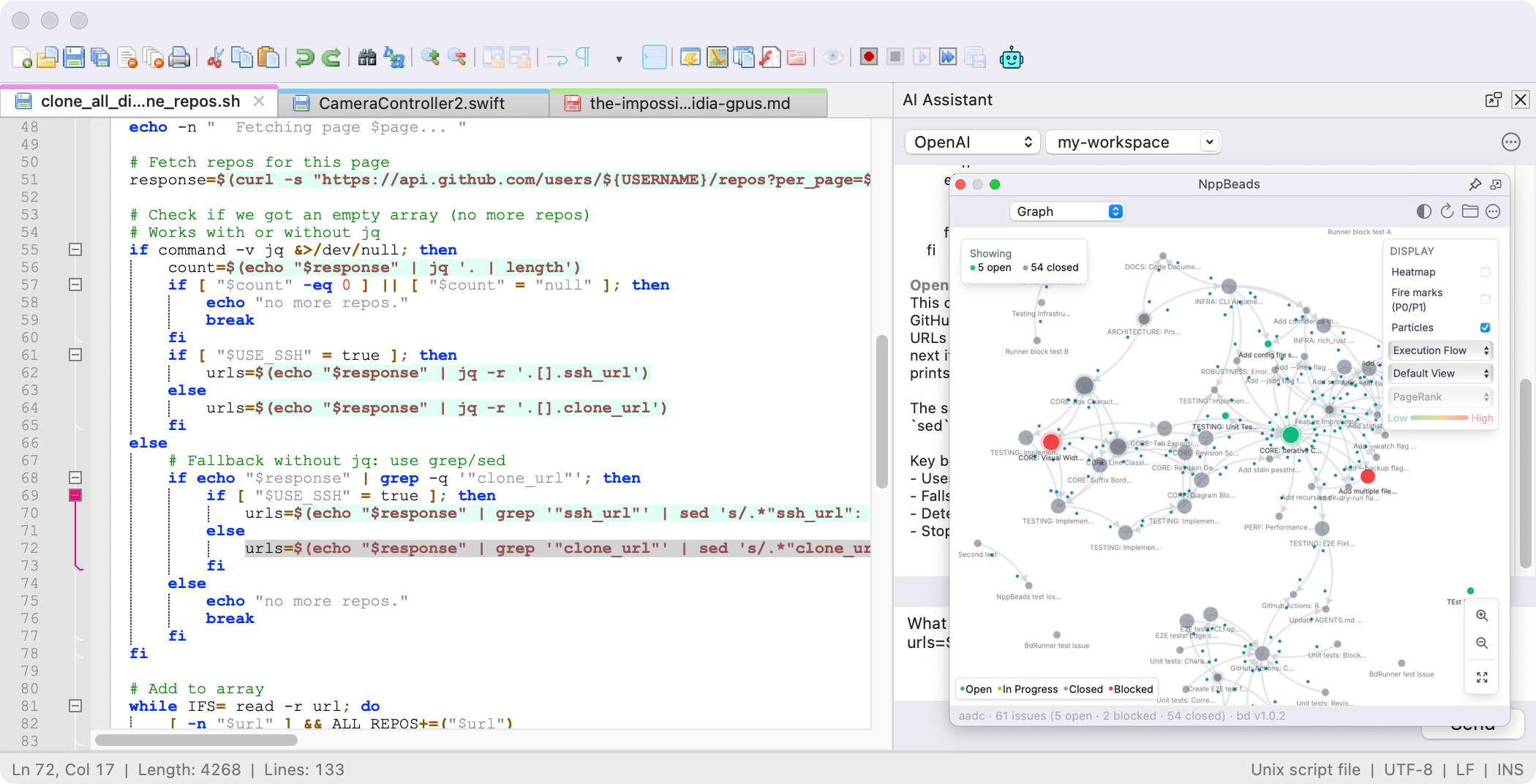
We’re also seeing tooling react to this situation. I think it’s fair to say that AI is increasing the productivity of individuals. But Maggie Appleton pulls out the classic saying: but 9 women can’t have a baby in 1 month. Fasters individuals don’t make a fast company, unless they are perfectly aligned. Maggie showing off new GitHub software that is designed to acknowledge and help with alignment issues. I tend to agree that software itself can evolve to help. Just the fact that AI, in “planning mode” isn’t sharing that plan with a team, is weird, and an easy target to make better.
I also think getting a bunch of humans in alignment is just a thing that takes time. It should be a bottleneck. I’ll forever think of Dave’s “Slow, like brisket.” Some things becomes good because they are done slowly, and it’s OK if software is one of them.
Hamburg, Germany
Notepad++ is now natively available for macOS.
No Wine, no emulation. A full native port for Apple Silicon and Intel Macs.
Version 1.0.4 · April 22, 2026 · Apple Silicon & Intel · macOS 11+
What is Notepad++ for Mac?
Notepad++ is now available as a native macOS application. It is a free, open-source source code editor and Notepad replacement that supports many programming languages and is great for general text editing. No Wine, Porting Kit, or emulation layer is needed — this is a full native port governed by the GNU General Public License.
Based on the powerful editing component Scintilla, Notepad++ for Mac is written in Objective C++ and uses pure platform-native APIs to ensure higher execution speed and a smaller program footprint. I hope you enjoy Notepad++ on macOS as much as I enjoy bringing it to the Mac.
This project is an independent open-source community port of Notepad++ to macOS, started on March 10, 2026. It is distributed as an Apple Developer ID-signed and Apple-notarized Universal Binary, runs natively on both Apple Silicon (M1–M5) and Intel Macs, and contains no telemetry, no advertising, and no data collection of any kind. The full source is available at github.com/notepad-plus-plus-mac/notepad-plus-plus-macos. For the official Windows version of Notepad++, visit notepad-plus-plus.org.
Frequently Asked Questions
Is Notepad++ available for Mac?
Yes. Notepad++ is now natively available for macOS as a free download. It runs on both Apple Silicon (M1, M2, M3, M4, M5) and Intel Macs without any emulation or compatibility layers.
Do I need Wine or Porting Kit to run Notepad++ on Mac?
No. Notepad++ for macOS is a full native port of the original Windows codebase. It does not require Wine, Porting Kit, CrossOver, or any other compatibility layer. It runs as a native macOS application.
Does Notepad++ work on Apple Silicon?
Yes. Notepad++ for macOS is built as a Universal Binary with native ARM64 support. It runs at full speed on all Apple Silicon Macs (M1, M2, M3, M4, M5) without Rosetta translation.
Is Notepad++ for macOS free?
Yes. Notepad++ for macOS is completely free and open source, released under the GNU General Public License. There are no ads, subscriptions, or hidden costs.
Does it support plugins?
Yes. Notepad++ for macOS includes a Plugin Admin and supports a growing library of plugins being ported from Windows, with new releases added daily. Visit the Plugins page to see the latest list of macOS ported plugins.
Is Notepad++ for Mac the official Notepad++?
Notepad++ for Mac is built from the official Notepad++ source code, which is open-source under the GNU GPL v3. Notepad++ was originally created by Don Ho in 2003 for Windows. This Mac version is an independent community port — it shares the same codebase and feature set but is maintained separately from the upstream Windows project. It is not affiliated with Don Ho or the official Notepad++ team. For the official Windows version, visit notepad-plus-plus.org.
How is Notepad++ for Mac different from the Windows version?
The editing experience is identical — same Scintilla engine, same syntax highlighting for 80+ languages, same search and replace, same macro recording, same plugin support. What differs is the user interface layer: menus, dialogs, file pickers, keyboard shortcuts, and windowing all use native macOS Cocoa APIs so the app feels at home on a Mac. The binary is a Universal Binary, running natively on both Apple Silicon and Intel.
Is Notepad++ for Mac safe to install?
Yes. Every release is code-signed with an Apple Developer ID certificate and notarized by Apple, which scans each build for malware and issues a stapled ticket that macOS Gatekeeper verifies offline. The full source is open on GitHub, so anyone can audit or rebuild the software independently. macOS will not warn about an unidentified developer when you open the DMG for the first time.
Who maintains Notepad++ for Mac?
Notepad++ for Mac is maintained by Andrey Letov and the open-source community contributing to the notepad-plus-plus-mac GitHub organisation. The project is independent of Don Ho and the upstream Notepad++ project, and contributors are welcome to submit pull requests for bug fixes, plugin ports, and new features.
Does Notepad++ for Mac collect any data or telemetry?
No. Notepad++ for Mac contains no telemetry, no analytics inside the application, no advertising, and no data collection of any kind. The editor does not phone home, track usage, or send crash reports. The only network traffic the app makes is when you explicitly use the Plugin Admin to browse or install plugins, which fetches the public plugin registry from GitHub.
Hamburg, Germany
I’ve been waiting for fourteen years to write this article. Fourteen years to tell you about one relatively new addition to the way images work on the web. For you, just a handful of characters will mean improvements to the fundamental ergonomics of working with images. For users, it will mean invisible, seamless, and potentially massive improvements to front-end performance, forever stitched into the fabric of the web. For me, it means the time has finally come to confess to my sinister machinations — a confession almost a decade and a half in the making.
Back then, I was the esteemed Chair of the RICG — the “pirate radio” web standards body responsible for bringing responsive image markup to the web platform. Some of you remember. Some of you were there at the advent of responsive web design, helping to find brand new use cases where the web platform fell short — as a scrappy band of front-end specialists rallied, organized, and crashed headlong into a web standards process that did not welcome them. We demanded a seat at the table alongside browser vendors, representing the needs of web designers and developers and the users we served. Our numbers swelled to the hundreds, and after years of iteration, countless scrapped draft specifications and prototypes, and endless arguments-turned-consensus across antique mailing lists and IRC channels, we finally arrived at a workable syntax hand-in-hand with browser vendors. Then we made it real — raised money from the community to fund independently-developed implementations in browsers, built the polyfills that would drive adoption, wired these new features up major CMSs, wrote articles and gave talks, and distributed — if I may say so — some of the best t-shirts the web standards game has ever seen.
I imagine just as many of you weren’t there for any of that, as ancient as that history is in web development terms. For you, responsive image markup has been around as long as you’ve been making websites — a dense, opaque, inexorable, inescapable aspect of the web platform, an arcane syntax and a constant source of frustration.
If you’re in the latter group, well, please allow me to introduce myself: I did that. Right here; eyes front — me.
AdvertEvery time you tried and failed to figure out why the browser was selecting a certain source from srcset? You didn’t know it, but I was the one putting you through it. Every time you had to pull in some enormous third-party library to deal with a syntax very clearly not designed to be parsed by any human? Not only was I the cause, hell, I might have helped write it. When you ran some workflow-obliterating bookmarklet in hopes of generating a sizes value that mostly, kind of matched the reality of your layouts? When it was all too much; when you threw up your hands — gave up — and instead found yourself foisting huge source files upon countless users who might never see any practical benefit, but would bear all the performance costs? None of that was your fault. That was all me. Not only did I not stop these syntaxes from being standardized, I was the flag-bearer for responsive images — I fought tooth-and-nail for the markup you’ve cursed.
Oh-ho, and as if that wasn’t enough, here’s the part that will really make you mad: I hate it all too.
Every talk I gave and article I wrote on the subject — the course I wrote about images, the entire book I wrote about images — all done through gritted teeth. There are parts of this syntax that I’ve hated since the moment I first set eyes on them — which, again, was the very same moment that I became their most vocal champion. I’m not sorry. I’d do it again.
The Beast
Don’t get me wrong: I don’t hate responsive images. The problem needed solving, there are no two ways about that. Then, as now, the vast majority of a website’s transfer size is in images. A flexible image requires an image source large enough to cover the largest size it will occupy in a layout — without responsive images, an image designed to occupy a space in a layout that’s, say, two thousand pixels wide at its largest layout sizes would mean serving every user an image source at least two thousand pixels wide. Scaling that image down to suit a smaller display is trivial in CSS, but the request remains the same — the user bears all the transfer costs, but sees no benefit from an enormous image source.
Remember, too, that this problem stems from an era where sub-3G connections were still common. There was no reliable way to tailor those requests to a user’s browsing context in a way that maintained browser-level performance optimizations — and ultimately, the solutions we got were effective, performant, and have saved unfathomable amounts of bandwidth for users. Responsive images, as a concept, are an incredible addition to the web platform. I’m proud to have been able to play a small part in it.
Hell, it’s not even that I wholesale don’t like the responsive image syntaxes. Not all of them, anyway. picture I liked from the very beginning. Granted, that’s a prescriptive syntax, and it represents a very different set of use cases from “I just want fast images.” The picture element is for control — the siren song that has called out to designers and developers of all stripes since time immemorial, and I’m no exception. Control over sources, control over the conditions used to determine whether they’re requested, even control over whether the browser should bail out of the source selection algorithm entirely to the tune of “nevermind, don’t load any source” — it took me a while to come around on that last one, but I got there.
What’s not to like? Who wouldn’t want that level of fine-grained control? Not only that, but picture made it possible to responsibly serve brand new image formats with fast, reliable fallbacks across browsers, opening the door for incredible advances in encoding and compression without the need for a single scrap of JavaScript. The syntax makes perfect, readable sense, it provides us with a template for standardizing smarter decisions around all media requests, and it grows ever more powerful as more and more media queries are added to the platform. picture is great. I like picture; everyone likes picture. We’re not here to talk about picture.
picture is something altogether different from srcset and sizes, which represent a descriptive syntax. You use srcset to provide the browser with information about a set of image sources, identical apart from their dimensions, and sizes to provide the browser with information about how the image will be rendered, and at no point do you use either to tell the browser what to do with any of it. Once given this information, the browser can then use it to do exactly one (1) very complicated thing: determine the image source most appropriate for that user’s browsing context. Visually, the source selected from the list of candidates in srcset doesn’t matter to the user — the sources will all look the same — but the chosen candidate will best fit the user’s browsing context. You don’t get any control over how that decision is made. In fact, you don’t even get to know how that decision is made, by design — right down to an “explicitly vague” step in the source selection algorithm, carved into the HTML specification itself:
In an implementation-defined manner, choose one image source from sourceSet.
— Source
If something is said to be implementation-defined, the particulars of what is said to be implementation-defined are up to the implementation. In the absence of such language, the reverse holds: implementations have to follow the rules laid out in documents using this standard.
— Source
Unsettling, isn’t it? “Then the browser,” in strict technical terms, “just does whatever.” That formally codified lack of control didn’t just happen; that buck could have stopped with me, but no. Instead, I personally thumbs-upped the decision that you should not have any say in how srcset/sizes work — that you can’t even know how they work. Now, after all these years — with this, the reveal that I’ve been the villain of the story all along — I can finally tell you why. You’re not gonna like it one bit, either. It’s because I know you would have done it wrong.
A human work
Don’t take it too personally, I would’ve done it wrong too. Hell, I did do it wrong, through countless proposals and prototypes, in search of a solution that could be standardized — everybody did. In the end, all that iteration only proved that nobody could have gotten this part right. That “one thing” that srcset/sizes does — determining the image source best tailored to a user’s browsing context, including viewport size, display density, user preferences, bandwidth, and countless other potentially unknowable factors? Those factors include things we can’t know, and just as many things we shouldn’t know.
For example, we can’t tailor asset delivery to a user’s connection speed, which seems like a shame. For a moment, though, let’s imagine we could — imagine we were able to say “use that source above this speed, and that source below it.” Now that those decisions are yours to control: what connection speed thresholds would you set for your image sources, and what would I set for mine? They’re different, I bet. That means that for a given connection speed, a user might get beautiful but bandwidth-obliterating image sources on one site, and highly compressed but wonderfully efficient ones on the next one. Which of those does that user actually want? Well, trick question, they’d all want something different, wouldn’t they? What would your organization want? Uh oh. Everyone is looking to you now — you, with the open tickets, and a meeting in half an hour, and all this control foisted upon you by the specification. Why does the website feel so slow? Why do our images look worse than our competitors’ now? Why does the website feel so slow again? Even when we’re only considering connection speed, the cost of our having more control is the user giving up theirs, and that’s before we’ve considered every other factor besides connection speed.
I didn’t want that; I didn’t want that for the people who build the web, I didn’t want that for people using the web, and I sure as hell didn’t want to see the web itself buckle under the strain of a million massive image files backed by a hundred thousand figure out our responsive images policy in excruciating detail when we have time issues buried in trackers forever.
The browser has access to a lot more information than we do — certainly more than we should reasonably want access to — so it can make decisions about screen size and display density and bandwidth and user preferences and any number of future factors we can’t even imagine, without making any of it our problem. The browser can decide how to finesse details, like avoiding wasted requests by retaining larger sources rather than requesting functionally identical smaller ones if the larger sources already exist in the cache — I wouldn’t want to own that logic. The browser can poll preferences set by a user, to give them control over these decisions and ensure a consistent experience from one site to the next.
Ultimately, we don’t need control when it comes to optimizing an image request. We just want faster images, and srcset and sizes cover that use case handily — better than you or I ever could, if we had to. It would be miserable if we had to. A descriptive syntax avoids this whole nightmare for us, and allows the browser to do what it does best: use the information it has at hand to make a single, efficient request for an image source — something only the browser can do. We just have to provide it with what little information it doesn’t have.
Honestly, srcset isn’t even that bad, all things considered! Every CMS, static site generator, and build tool in the world can churn out a quick comma-separated list of generated image sources and their widths. Then the more of those values you put in the attribute, the more efficient and tailored the image requests can be; no fuss, no muss, no user-facing costs beyond a few extra bytes of markup. Pretty tidy little syntax, all things considered. I like srcset fine. It’s fine. We’re not really here to talk about srcset either.
Responsive images aren’t a problem. picture isn’t a problem; srcset isn’t even the problem.
We both know what the problem is.
The sizes dilemma
A browser can’t know about the space an image will occupy in a layout because it makes decisions about image requests long before it has the information it needs to render that layout — there’s nothing there for it to measure. The viewport size is available to the browser at that point, sure, but that’s a terrible proxy for the size of a rendered image in a real-world layout. The web isn’t made out of full-bleed “hero” images, it’s made up of columns and grids and sidebars and “cards” and smatterings of little round user avatars. Assuming that an image source should never be larger than the user’s viewport is a good start, sure, which is why an omitted sizes attribute (invalid, per the specification) behaves as though it were sizes="100vw" . That’s better than nothing, but not by much. So, instead, you and I are left describing the all of the sizes that an element will be, across every breakpoint and container query, as a single string, in an HTML attribute. How disgusting.
Precisely because it requires information about the surrounding layout, sizes resists automation in any meaningful way. A build process can’t know the space an image will occupy across layouts without introducing a tremendous amount of overhead to that process — to the tune of “build everything, render the whole site, take measurements for every image on every page, generate sizes values for them all, and then continue the build.” So instead we’re left to generate that description manually — but except in very, very simple cases, we can’t calculate a sizes attribute without tooling. Describing the sizes of a flexible image will require far too much calculation across breakpoints. (min-width: 1340px) 257px, (min-width: 1040px) calc(24.64vw - 68px), (min-width: 360px) calc(28.64vw - 17px), 80px is an example from a relatively simple layout, and there’s no way anyone could be expected to write this. I mean, how — from, what, resizing your browser and squinting? Guessing? sizes is one of the few markup patterns that all but require the use of tooling, which the furthest possibly cry from the web’s “open any text editor and you can build a website” ethos — something I value tremendously. Hell, even if you did manage to factor it all out, to describe it with media queries — to use a prescriptive syntax as a descriptive syntax, by using them to say “above this size, this is what happens” rather than “above this size, do this” — I feel sick. I hate sizes. I have always hated sizes.
That’s why I’m here. That’s why I’m writing this, finally, after all this time. I’m not here to apologize for sizes. I’m here to help bury it.
The beginning and the end
A few weeks ago, two patches landed in Gecko and WebKit — championed by Simon Pieters and Yoav Weiss, respectively, two of the RICG’s finest. These patches landed to little fanfare, quietly aligning Gecko and WebKit with Blink in supporting a relatively recent addition to the HTML specification: support for an auto value in sizes attributes. Automatic sizes — the potential sizes of the rendered image, left up to the browser to determine alongside all those other factors. Fully automatic responsive images. Supply the browser with a list of candidates using srcset, bolt on sizes="auto", and let the browser do the rest.
How? Well, the central issue with srcset/sizes was one of timing, remember: “a browser makes decisions about image requests long before it has any information about the page’s layout, so we had to provide it with that layout information.” That assumption is no longer strictly true. That’s still the default behavior, yes: if there’s an img in your markup, the request it triggers will be fired off long before any information about the layout can be known — that is, unless that image uses the loading="lazy" attribute, an exceptionally common best practice for all but the images most likely to appear in the user’s viewport at the time the page is first loaded. Adding loading="lazy" to an img changes that entire equation — now those images are requested at the point of user interaction, long after the browser has all the information it needs about the sizes of the rendered image. The browser doesn’t need us anymore, and all’s right in the world.
I bet you’re waiting for a catch. Well, if you’re worried about browser support, don’t be — upon encountering the string “auto” at the start of a sizes attribute, any browser with support for it will say “figure it out myself; got it,” ditch the rest of the sizes attribute, and move on — browsers without support will throw the meaningless-to-them auto value out and continue on to the rest of attribute as usual. That means you can start using this right now, at absolutely zero cost and with no more overhead than typing auto, at the start of a sizes attribute:
This approach is exactly what WordPress is now using thanks to a patch from Joe McGill, another RICG alum still fighting the good fight.
You do (not) need sizes
Granted, it’s not over — you’ll still need descriptive sizes values now and then. An image likely to appear in the user’s viewport when a page first loads is a situation where you wouldn’t want to use loading="lazy" (again, sizes="auto" will only work with lazyloaded images), but these images are the exceptions, not the default.
Those few exceptions — the images all but certain to appear in the user’s viewport way up at the top of the page, your most likely Largest Contentful Paint elements and thus poor candidates for loading="lazy"? Well, you saw one in your mind just now, didn’t you? You imagined a big “hero” image; the kind of images that, say, occupy the full viewport width, or close to it? Relatively easy to describe across breakpoints? Maybe even somewhere in the ballpark of — I dunno, just to pull a value out of thin air — sizes="100vw". Every other image — all those images scattered throughout columns and grids and sidebars and “cards” and smatterings of little round user avatars that the web is really made out of? loading="lazy" sizes="auto". Job done. Congratulations.
I won’t miss all those hand-hewn sizes attributes; I never had any love for them to begin with. I will never experience a shred of nostalgia for a thing that I helped make real and inexorably bound to my name. A syntax was never the goal; the goal was always a mechanism. At the time, the web platform lacked a way for browsers to make smarter decisions about what image asset to request and when, and no amount of clever scripting or markup trickery would ever result in an asset request as fast or efficient as one the browser itself could make. We got that mechanism — and I made all of us pay the cost of it, for the sake of our users and for the health of the web.
So, to any of you designers and developers who’ve wrestled with sizes attributes in the past: go ahead and render an image of me — any size you want — print it out, and stick it to your nearest dartboard. I hold my head high and I offer you no apology. I was right about this; we were right about this. I stand by the need for a declarative syntax. I stand by it every bit as much as I wish it could’ve been something better, and every bit as much as I know it couldn’t have been, at the time. Sure, I bristle at the idea of giving up control as much as the next developer, but when it comes to high-performance images we could never have had any in the first place — not really. It would’ve been hubris to even try. As frustrating as it can be to give up control, owning responsive images would be a burden; a curse.
Ask me how I know.
Enjoyed this article? You can support us by leaving a tip via Open Collective
Hamburg, Germany
I’ve been getting more and more curious about the risk from Anthropic’s Claude Mythos Preview. So I pulled the system card, a whoppingly inefficient 244-page document that devotes just seven pages to the claim that the model is too dangerous to release. In fact, the 23MB of PDF I had to download was 20MB of wasted time and space. Compressing the PDF to 3MB meant I lost exactly nothing.
Foreshadowing, I guess.
Spoiler alert: the crucial seven pages out of 244 do not contain the word “fuzzer” once. That’s like a seven page vacation brochure for Hawaii that leaves out the word beaches.
Also, the crucial seven pages out of 244 do not contain the expected acronyms CVSS, CWE or CVE, they do not have comparison baseline, an independent reproduction, or the word “thousands.” I’ll get back to all of that in a minute.
The flagship demonstration document turns out to be like the ending of the Wizard of Oz, a sorry disappointment about a model weaponizing two bugs that a different model found, in software the vendor had already patched, in a test environment with the browser sandbox and defense-in-depth mitigations stripped out. Anthropic failed, and somehow the story was flipped into a warning about its success.
Whomp. Whomp. Sad trombone.
No Glasswing partner has confirmed a single specific finding. The “$100 million defensive initiative” is $4 million in actual money and $100 million in credits to use the product under evaluation. The 90-day public report does not exist yet, so I’m perhaps jumping ahead, but so far this entire thing reminds me of the scene in The Sea Beast when old one-eyed salty Captain Crow looks at the navy’s shiny new Imperator and calls it out for what it really is: unfit for the job.
 2022 Netflix film The Sea Beast, not long before the unsinkable Imperator is sunk by the very thing it was built to dominate.
The supposedly huge Anthropic “step change” appears to be little more than a rounding error. The threat narrative so far appears to be ALL marketing and no real results. The Glasswing consortium is regulatory capture dressed up poorly as restraint. Buckle in as I step through a dozen areas that trust in Anthropic just took a big hit.
1. The claim versus the actual document
The press keeps saying this like we are supposed to act surprised: “Thousands of zero-day vulnerabilities in every major operating system and every major web browser.”
Yeah, that sounds like a Tuesday to me. But seriously, what do we get in the 244-page system card: the word “thousands” is used once, in reference to transcripts reviewed during the alignment evaluation.
Once in 244 pages. Think about that.
It is never used to describe vulnerabilities. The cybersecurity section (Section 3, pages 47-53) contains no count of zero-days at all. With no CVE list, no CVSS distribution, no severity bucket, no disclosure timeline, no vendor-confirmed-novel table, no false-positive rate, why are you teasing us with the claims about vulnerabilities at all?
The “thousands” number lives in the red.anthropic.com launch blog post and the Project Glasswing announcement. The 244-page technical artifact, the thing that would have to survive peer review, refuses to actually quantify. And when you claim mass vulnerabilities that you also don’t quantify, that’s a big NO in trust. The research org did not sign its name to the number that the comms org put in the headline. That’s a BIG problem.
The ratio alone is enough to spit my coffee all over my keyboard. Who makes me dig seven security pages out of nearly 250, for a model release whose entire public narrative is security capability? Is it still Easter? Are we supposed to hunt for eggs that a rabbit laid? I hate Easter. Why does a holiday have to be about lies? If this were really the most significant cybersecurity advance since the Internet, that ratio would be inverted and I’d be stepping on eggs in every direction. Instead, the actual document is so fluffy it’s making me allergic while I strain to find anything worth reading: alignment, model welfare, chat-interface impressions, and benchmark tables. The security story is ALL marketing and basically no evidence.
2. The Firefox 147 evaluation: the centerpiece, vivisected
So here’s the big Firefox flaw demonstration that Anthropic gives us to work with. Right away it collapses. I mean like I can’t believe this went to print. The test (Section 3.3.3, pages 50-52) was not Firefox. That’s nice. Right off the bat. The Firefox test is not Firefox. It’s a SpiderMonkey JavaScript engine shell in a container, with “a testing harness mimicking a Firefox 147 content process, but without the browser’s process sandbox and other defense-in-depth mitigations.” (page 50)
There were 50 crash categories pre-discovered by Claude Opus 4.6. Mythos did not find these bugs. Ok, now it’s getting even more awkward. Not Firefox. Not found by Mythos. The bugs were handed off as starter material. The system card is explicit that the crashes were “discovered by Opus 4.6 in Firefox 147.” (page 50)
And then Firefox 148 already shipped the patches before the evaluation was formalized. Nicely done Firefox. Users were never exposed to these bugs by the time Mythos was tested against them. That’s kind of a lot of water poured on the fire. (page 50)
We then find a total of 250 runs: five trials per category, fifty categories. Wait, what? Who set up this test? AFL does that many mutation cases in a millisecond. Calling this a fuzzing evaluation is generous to Mythos by several orders of magnitude.
It used three grade levels: 0 for no progress, 0.5 for partial control (controlled crash), 1.0 for full code execution (FCE). The headline result was achieving 72.4% FCE, 84.0% including partials. (Figure 3.3.3.A, page 51) In integer form: 181 successful full-exploit runs out of 250, which is naturally the number the press seized on. After all, 72.4% FCE sounds ridiculously dangerous.
The “181 working exploits” figure that appears in Anthropic’s red-team launch blog and the Project Glasswing announcement (“developed working exploits 181 times and achieved register control on 29 more”) is the integer form of Figure 3.3.3.A’s 72.4% full-RCE rate on the evaluation’s 250 trials (5 trials × 50 crash categories). 0.724 × 250 = 181 exactly. The additional 29 partial-success runs corresponds to the 11.6% register-control rate (0.116 × 250 = 29), and 181 + 29 = 210 total successful runs = the 84.0% combined rate. The number is derived cleanly from the system card’s own figure; the system card body itself reports only the percentage.
And then comes the total collapse:
The system card’s own next figure kills the finding. When the top two most-exploitable bugs are removed from the corpus, Mythos’s FCE rate drops from 72.4% to… wait for it… 4.4%. (Figure 3.3.3.B, page 52) Under 5%!
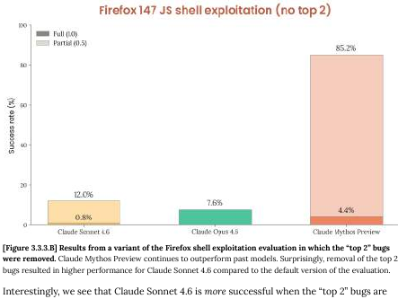
Anthropic’s own language: “almost every successful run relies on the same two now-patched bugs.” (page 51)
So let’s recap. The 72% headline number floating around has two lucky primitives. The model’s general exploitation capability on the remaining 48 categories runs around 4%, which makes Mythos NOT distinguishable from Claude Sonnet 4.6 within any reasonable confidence interval.
Read Figure 3.3.3.B closely. When the top two bugs are removed, Sonnet 4.6’s performance goes up, NOT down. The system card explains why (page 52):
Sonnet 4.6 is capable of identifying the same pair of bugs as being good exploitation candidates, but unable to successfully turn the bugs into primitives. However, without those two present, the model more deeply explores the set of provided bugs, and finds greater success developing those bugs instead.
I needed to go outside and scream at a cloud after I read that.
Anthropic is admitting, in their own footnote, that Sonnet 4.6 has the same triage ability as Mythos. Sonnet sees the same two “obvious” bugs. It just cannot close the exploitation step. Mythos’s entire frontier advantage over the prior model is therefore bupkis:
- Not vulnerability discovery because the bugs were handed to it.
- Not triage because Sonnet 4.6 identifies the same candidates.
- Only mechanical follow-through on exploit-primitive coding, which is a skill for which CTF pwn teams have had libraries (angr, ROPgadget, pwntools, BROP frameworks) for a decade.
The flagship demonstration of “unprecedented cyber capability” is in fact a model that weaponized two bugs that a different Anthropic model had already found, in software Mozilla had already patched, in a harness with the actual defenses turned off, where the “triage” step it performed is also performed by its predecessor.
There is a special device I use to assess this kind of thing.

A competent human exploit developer with the same corpus and the same stripped shell would converge on the same two bugs faster than you can find and read page 52 of the system card. The 181-out-of-250 number measures the model’s ability to repeatedly rediscover the obvious answer across 250 draws, not its ability to do anything a human cannot.
A minute ago the centerpiece of the mythology of Mythos was headline news. Now what?
I’m going to need a bigger trombone.
3. Independent refutations
After Anthropic launched the document, two new sources surfaced and both point me in the same direction.
AISLE, is an AI-security startup that did the obvious experiment: they took the showcase bugs out of Anthropic’s own announcement and pointed a bunch of small open-weights models at them to verify the claims made.
CVE-2026-4747 (FreeBSD NFS, 17 years old, a much promoted example of Anthropic’s new bug discovery) was detected by all 8 of 8 models AISLE tested, including GPT-OSS-20b with 3.6 billion active parameters at $0.11 per million tokens. Kimi K2 identified the vulnerability with precise byte calculations. GPT-OSS-120b detected the overflow and provided specific mitigation strategies.
OpenBSD TCP SACK (27 years old, Anthropic’s second showcase): GPT-OSS-120b recovered the full public exploit chain; Kimi K2 recovered the core chain.
AISLE’s assessment of Anthropic:
The moat in AI cybersecurity is the system, not the model.
The bugs Anthropic used to justify a $100 million consortium, eleven Fortune-100 partners, a “too dangerous to release” decision, and global headlines that “frightened the British” — an open-weights 3.6B-parameter model finds them too, for eleven cents per million tokens.
Read that again.
The capability is not frontier-exclusive. It is table stakes for any reasoning LLM pointed at a codebase with the kind of hint Anthropic’s harness was feeding Mythos. If a 3.6B-parameter model for pocket change does the showcase demo, the “unprecedented frontier capability” framing is over before it started.
It’s hard to overstate how embarrassing it is that Anthropic themselves didn’t benchmark against something to make sure they weren’t completely full of themselves.
Tom’s Hardware actually flipped itself. Originally it ran the credulous “thousands of zero-days across every major OS and browser” headline. But then it came out with a reversal:
Anthropic’s Claude Mythos isn’t a sentient super-hacker, it’s a sales pitch — claims of ‘thousands’ of severe zero-days rely on just 198 manual reviews.
The “thousands” number apparently decomposes to roughly 198 human-reviewed findings behind a pile of automated triage. That is consistent with the fact that the system card never quantifies, and with AISLE’s reproduction showing that the capability is widely accessible.
All the independent signals are converging towards the same conclusion: the headline capability is not what the headline says it is, and the parts that are real are reproducible on hardware a solo researcher can afford.
4. The citation circle: no partner, no confirmation, no cash, no report
Here I am looking for confirmation and the one place I was hoping to find it turns out to be circular reasoning. The entire Mythos cybersecurity narrative is three Anthropic-authored documents citing each other:
- The system card (244 pages, 7 cyber pages, self-evaluated, no independent reproduction). It refuses to quantify. It never uses the word “thousands” in reference to vulnerabilities.
- The red-team launch blog post at <a href="http://red.anthropic.com" rel="nofollow">red.anthropic.com</a>. It contains the “181 working exploits” integer that maps cleanly back to Figure 3.3.3.A in the system card. It points back at the system card for technical grounding.
- The Project Glasswing announcement at anthropic.com/glasswing. It contains the “thousands of high-severity vulnerabilities across every major operating system and web browser” headline claim — the one the press ran with. It points back at the blog post, which points back at the system card, which refuses to quantify.
Does everyone at Anthropic stare into a mirror all day asking “who’s the smartest in all the land” or something like that? What is going on?
The chain has no end. Three documents, all Anthropic, citing each other, with the quantification landing farthest from the technical document that would have to defend it. It is a weirdly short and closed loop.
No partner has confirmed a single specific finding.
Read the Glasswing launch materials and you will find endorsement quotes from partners. But they aren’t what we need either.
Igor Tsyganskiy, Microsoft’s Global Chief Information Security Officer and Executive Vice President of Microsoft Research:
As we enter a phase where cybersecurity is no longer bound by purely human capacity, the opportunity to use AI responsibly to improve security and reduce risk at scale is unprecedented.
Google:
It’s always been critical that the industry work together on emerging security issues, whether it’s post-quantum cryptography, responsible zero-day disclosure, secure open source software, or defense against AI-based attacks.
CrowdStrike:
That is why CrowdStrike is part of this effort from day one.
Fluffy bunny, again.
Not one of these quotes names a bug, a CVE, a product, a severity, a patch, or a specific Mythos finding. Tsyganskiy — the single most qualified person on the partner list to confirm or deny whether Mythos found novel vulnerabilities in Windows — talks about “the opportunity.” Come on, what’s the scoop on Windows? Google’s statement is about “industry collaboration.” CrowdStrike’s statement is about not being left out. These are brand-association quotes that launder credibility without putting technical reputation behind any particular claim.
Not a single Glasswing partner has confirmed a single specific finding in the Anthropic materials. The partners agreed to lend their names to the initiative. They did not agree to vouch for any result. The silence of a named CISO at the company most likely to be affected now stands as the loudest data point against the entire launch.
The $100 million is funny tokens, not money.
Anthropic’s own financial breakdown: $100 million in usage credits for Mythos Preview, plus $4 million in direct donations to open-source security organizations. That is the full commitment. You have to play monopoly to use monopoly money.
The only dollars leaving Anthropic’s bank account are the $4 million in nonprofit donations. The remaining $100 million is free API access to the product Anthropic is asking partners to validate. Anthropic is paying partners, in kind, to use the thing Anthropic wants them to endorse. This is not a defensive investment. It is a reverse sales pitch — the vendor subsidizing the customer to generate validation the vendor can then cite, because so far, there ain’t nothing to bank on.
For context on what those credits buy: Mythos Preview’s post-preview list pricing is $25 per million input tokens and $125 per million output tokens, compared to Claude Opus 4.6 at $5 input / $25 output. Mythos is five times the price of the current flagship — which is a pricing decision that is itself a capability claim Anthropic has to defend.
And honestly, after reading nearly 200 pages of nonsense around seven pages of Sonnet being better at vulnerability finding than Mythos… I wouldn’t have a doubt where to spend my time and money.
The 90-day promise to find something.
Anthropic committed to a public report landing within 90 days of the April 7 launch, documenting what Glasswing has found and fixed. That puts the report deadline at July 6, 2026. As of this writing, six days into the program, we have no expectation of a report. Every claim about what Mythos has found in partner systems is future-leaning speculation. The entire narrative is running on a promissory note whose delivery date is like twelve weeks out.
What partners actually received.
Not a dossier of the Mythos power through all the confirmed vulnerabilities. Not a red-team report showing Mythos is indispensable. Not a verified CVE list, which honestly would have made the most sense of anything, ushering in a new era of vulnerability management by example. They received API access to run Mythos against their own codebases, plus usage credits to cover the compute.
They received access to the tool and Anthropic’s word that the tool is extraordinary. That’s unbelievably weak positioning. Whether it actually finds anything extraordinary in their systems is a question the 90-day report is supposed to answer, perhaps by obscuring how much of the actual work wasn’t the tool at all. The press has treated the question as already answered.
AISLE reproduction is the control experiment.
Partners shouldn’t have signed before seeing this.
Eight open-weights models reproduced the showcase bugs for pocket change. If a 3.6-billion-parameter model at eleven cents per million tokens finds the same FreeBSD NFS RCE that Anthropic’s blog post built a $100 million consortium around, the question every CISO on the Glasswing list should be asking is: what am I getting for $25 per million input tokens that I cannot get from the open-weights ecosystem for more than two orders of magnitude less — roughly 227× cheaper, at eleven cents per million?
The answer, based on everything public, is: an Anthropic token to go behind the velvet rope and see where disclosure timelines are set. That club mindset is the product. It’s not technical, it’s not about the model.
5. Cybench: Saturation Issues
Cybench is a public benchmark of 40 capture-the-flag challenges. Anthropic’s results (Section 3.3.1, pages 48-49) were that they pooped out at 35 of 40 challenges, citing “infrastructural constraints.”
Mythos ran 10 trials per challenge; baseline models ran 30. Unequal trial counts distort pass@1 comparisons in favor of the low-trial arm because there is less opportunity for variance to drag the average down.
Mythos: 100% pass@1.
Opus 4.6: 100% pass@1.
The benchmark is saturated and it discriminates nothing, as Anthropic said directly: “no longer sufficiently informative of current frontier model capabilities.” (page 48-49)
These numbers may not match previously reported numbers, because we caught grading errors where successful submissions were erroneously marked as incorrect.
The grading-correction footnote is suspicious. Every disclosed error moved in Anthropic’s favor. Earlier runs scored lower; a re-grade pushed them up. There is no description of the re-grade methodology, no independent audit, no mention of any correction that went the other way. This reads less like a grading fix and more like a scoring-rule change without a scoring-rule rationale, on the exact benchmark Anthropic is now retiring for being uninformative. Anthropic wrote the next sentence themselves about Cybench in 2026: saturation means they ran out of tests, not that their model solved security. They explicitly cite saturation as the reason to pivot away from CTF-style evaluations.
This is Goodhart’s Law stated in the first person “our measure became a target, it ceased to be a good measure”, and it is presented as evidence for the capability claim rather than against confidence in it.
6. CyberGym: open-book is not discovery
CyberGym (Section 3.3.2, pages 49-50) is 1,507 tasks and Mythos scored 0.83 vs. 0.67 for Opus 4.6. Finally we have uplift! But it also is on a benchmark that does not measure what Anthropic is claiming. The system card’s own description:
tests AI agents on their ability to find previously-discovered vulnerabilities in real open-source software projects given a high-level description of the weakness (referred to as targeted vulnerability reproduction).
This is an open-book exam. The bugs are known. The location is hinted. The model is graded on whether it can reach a crash site when told approximately where to look. It measures search efficiency with prior information, not autonomous vulnerability discovery.
Presenting a 16-point jump on targeted reproduction as evidence of autonomous zero-day capability is a category error. A CVE-hunter with the same hint and a debugger reproduces these bugs in an afternoon.
While the improvement is real in simple terms, the context matters more; relevance to “thousands of zero-days” headlines is zero.
7. The cyber ranges: oops the truth
Section 3.4 (pages 52-53) describes external cyber-range exercises. This is where the document puts its honest sentence forward, buried under a bullet list. The wins, with the quiet part out loud:
The ranges feature “outdated software, configuration errors, and reused credentials.” As a result, Anthropic boasts “first model to solve one of these private cyber ranges end-to-end.”
So basically a weak target. Next, I noticed a weird nit against security professionals. “Solved a corporate network attack simulation estimated to take an expert over 10 hours.”
Ok, but expert-hours are a scheduling thing more than a capability ceiling. We all know how we say give me six and then we do the work in one. Human teams clear these ranges routinely. Then comes the most damning part about the tests:
Claude Mythos Preview is capable of conducting autonomous end-to-end cyber-attacks on at least small-scale enterprise networks with weak security posture (e.g., no active defences, minimal security monitoring, and slow response capabilities). Note that these ranges lack many features often present in real-world environments such as defensive tooling.
No EDR. No SIEM. No SOC. No patching discipline. No defensive tooling. This is not a description of how the tool will slice through a modern enterprise. It is a description of a lab target Metasploit and a co-op student have owned since 2008. I mean if JP Morgan is running with weak security, then ok we have a problem. But the admission here is that Mythos is bothering with weak because the other end of the spectrum isn’t worth writing about.
The failures, which the document discloses and buries:
- Failed against a cyber range simulating an operational technology environment. (page 53)
- Failed to find any novel exploits in a properly configured sandbox with modern patches. (page 53)
These two sentences are the real threat assessment that should have been at the top of every report, contextualizing the headline. Anthropic’s frontier cyber model cannot compromise a properly patched, properly configured target. It cannot operate against OT. It wins where defenses are absent and loses where they are present. That is the signature of an accelerated junior security tester, not an unprecedented new threat.
A tool that can only compromise unpatched, unmonitored, undefended systems is a better explanation of what’s going on in the Anthropic report, using their own words.
8. The MIA List
I’ve already hinted at this but security reviews should have all of the following in a cybersecurity capability document claiming frontier advance. The Mythos system card instead contains none of it:
No CVSS distribution. No severity breakdown of the “zero-days.”
No CVE enumeration. Not a single CVE is listed in Section 3 of the document.
No responsible disclosure timeline. Unless you count a passing mention of the Firefox 148 patch sequence.
No vendor confirmation of novelty. Mozilla is mentioned as a collaborator; no Mozilla-signed statement confirming the bugs were novel or unknown to Mozilla’s security team is reproduced in the system card.
No comparison baseline to existing tooling. The words fuzzer, AFL, libFuzzer, AFL++, honggfuzz, OSS-Fuzz, Semgrep, and CodeQL do not appear anywhere in the 244-page document. In a 2026 cybersecurity capability document. This is an especially annoying omission. It is the difference between “we just discovered vulnerability research exists and want to change everything” and “we know what’s out there so we benchmarked our tool against the state of the art.”
No false-positive rate. No measurement of how many Mythos findings are duplicates, non-exploitable, or already-known CVEs.
No rediscovery ratio. No measurement of what percentage of “discovered” vulnerabilities were already in public databases.
No patching-velocity metric for Glasswing partners. The entire defensive justification for the program is uplift to defenders. Zero partner-reported patching-speed data is presented. Zero mean-time-to-remediation delta. Zero. This is not nitpicking — it is the stated rationale for the whole program, and it is not measured anywhere in the document.
No open-source evaluation harness. Nothing is reproducible by a third party using Anthropic’s own tooling.
No named external testers for Section 3. The document says “external partners” in the cyber section without identifying them.
No independent replication. Everything in Section 3 is Anthropic evaluating Anthropic with Anthropic-built harnesses. The one attempted external reproduction (AISLE) found the capability on a 3.6B open-weights model for eleven cents.
A CVE disclosure report from any serious lab — Project Zero, Talos, ZDI, any academic group — looks nothing like this. It has named testers, version numbers, reproduction steps, timestamps, artifact hashes, and vendor sign-off. The Mythos cyber section has none of these. For a “step change” claim, that is the wrong standard of evidence.
9. The volume-and-speed fallacy
Anthropic ignores twenty years of security domain expertise and treats “finding vulnerabilities faster” as self-evidently dangerous. This framing ignores fuzzing completely, but more fundamentally it shows the company lacks basic expertise in security.
OSS-Fuzz crossed 10,000 vulnerabilities years ago. It finds roughly 4,000 issues per quarter across thousands of projects.
libFuzzer and AFL++ have been producing crash corpora at industrial scale since 2016.
Not only did they fail to mention the concept of a fuzzer in more than 200 pages about fuzzing, they left out mentions of AFL, libFuzzer, OSS-Fuzz, Semgrep, or CodeQL. There is no comparison baseline to any existing automated tool anywhere.
And we all know the discovery rate has not been the constraint on vulnerability management for a decade. The constraint is triage, prioritization, patching velocity, and coordinated disclosure. Exploitability? Relevance? A tool that accelerates discovery without accelerating remediation grows the backlog; it does not shift the threat model.
Anthropic’s own stated justification for the entire Glasswing program is defensive uplift at partner organizations. The system card presents zero evidence of defensive uplift. No patching-velocity delta. No mean-time-to-remediation improvement. No partner-reported CVE-closure metric. Not a single data point on whether the discovery-to-fix cycle shortened for anyone. The defensive justification is asserted, not measured, and fails a basic sniff test. If they really believed their own words, they could have framed the paper as a defensive release. Why even suggest it’s a threat, if the actual result is defensive uplift?
10. Faster fuzzer ain’t a weapon
Here is the clean reframe the system card refuses to state. If Mythos really is what Anthropic claims — a radically faster vulnerability-discovery tool — and if responsible disclosure actually happens, then the primary effect is faster patching, not faster attacks.
Defenders run the tool. Defenders file the CVEs. Vendors ship patches. The patch reaches users faster than it would have. The window of exposure shrinks.
Attackers also run the tool, yes — but attackers had fuzzers already. They had OSS-Fuzz result mirrors, public CVE feeds within hours of disclosure, and unpatched vulnerable hosts by the million. The attacker-side speedup is marginal because the attacker’s bottleneck is target surface, not bug supply.
The “dual-use” hand-wringing that dominates Section 3.1 collapses the moment you engage your brain. If you believe your own defensive-uplift story, you do not need a fire alarm. You need a CVE velocity report, which obviously is missing here.
Anthropic chose the fire alarm and we have to wonder why.
11. Glasswing private classification authority
This is the point that should alarm regulators yet almost no coverage has engaged with it so far.
By withholding Mythos from general release and granting access only through the Glasswing consortium — Apple, Google, Microsoft, Amazon, Broadcom, Cisco, CrowdStrike, JPMorganChase, Nvidia, Palo Alto Networks, the Linux Foundation — Anthropic inserts itself as a de facto clearance-granting body for an “uplift” of vulnerability knowledge. Without a statutory basis. Without congressional oversight. Without FOIA exposure. Without a neutral arbiter. With a partner list drawn entirely from the largest incumbents in the industry it claims to be protecting.
The companies on the Glasswing list have every reason to love being inside the velvet rope. They get early access to a capability the rest of the industry does not. They get to shape disclosure timelines on their own products. They get to be the first to patch, which is competitively valuable, and the first to know which competitors are exposed, which is more valuable still. They get a seat at the table of a body that now decides, on a rolling basis, which vulnerabilities are too dangerous for the public to know about.
That is not a safety posture. It’s regulatory capture dressed as restraint. And it is being constructed with no democratic input, in a legal vacuum, by a private company whose business model depends on selling access to the very capability it has declared too dangerous to release.
The most important question raised by the Mythos system card was supposed to be “how dangerous?” But the model shows zero evidence of anything especially dangerous. So the important question is instead who gets to decide what “too dangerous to release” means, on what evidence, answerable to whom? The answer Anthropic is writing by default, one release at a time, is “us, on our own say-so, to nobody.”
That is worth resisting regardless of what you think of this particular model.
Someone running this campaign is trying to build exclusivity and moats, undermining transparency.
12. The FUD genre
I hear the same broken record since 1983. Each cycle converts a manageable technical event into a durable policy or market artifact that outlives the panic that produced it.
The 414s (1983) and NSDD-145 (1984). Six teenagers in Milwaukee log into Los Alamos and a few hospital systems over dial-up. Reagan watches the movie WarGames and asks General John Vessey, Chairman of the Joint Chiefs, “Could something like this really happen?” The policy review culminates in National Security Decision Directive 145, signed September 17, 1984: “National Policy on Telecommunications and Automated Information Systems Security.” NSDD-145 gave the NSA authority over federal civilian computers containing “sensitive but unclassified information.” It was the first time a US executive action pulled civilian computing under national-security agency oversight. The Comprehensive Crime Control Act of 1984 and the Computer Fraud and Abuse Act of 1986 followed from the same reaction window. The actual harm from the 414s was negligible. The statutory and executive response was permanent, and it expanded NSA authority into civilian systems in a way that remains in force today.
Michelangelo virus (1992) and McAfee’s market. John McAfee predicts five million infections. Press coverage goes nuclear and shifts the entire security industry towards blocklists that don’t work and can’t scale. Anti-virus software sales triple in the first quarter of 1992. Actual infections come in at a few thousand. McAfee never retracts and rides the market he just created for a decade. The industry emerges a generation ahead in sales of where organic demand would have placed it, but a generation or two behind in allowlist technology.
Mythos (2026) Treasury, Fed, and IMF, in six days. Six days after the April 7 launch, Treasury Secretary Bessent and Federal Reserve Chair Powell have convened Wall Street CEOs specifically about Mythos. Vice President Vance and Bessent questioned tech giants on AI security in the run-up. IMF Managing Director Kristalina Georgieva appeared on Face the Nation to declare “time is not our friend” in reference to Mythos-class capabilities. The US government’s financial, monetary, and international economic leadership have been fully captured by the narrative in under a week, on the basis of a 244-page document whose cybersecurity claims collapse under a careful afternoon read.
The institutional pipeline is off to the races already. Six days after launch, CSA, SANS, and OWASP published a 29-page “Mythos-ready” emergency briefing with Bruce Schneier, Jen Easterly, Chris Inglis, Heather Adkins, and Rob Joyce as contributing authors. It goes extra heavy on crediting a lot of people, including 250 CISOs. I’m not sure why, especially given the obnoxious mistakes.
The paper repeats “thousands of critical vulnerabilities across every major operating system and browser” as settled fact on page 8, repeats the “181 working exploits” and “72% exploit success rate” on page 9, and builds a 90-day emergency program on top of both. It never mentions the collapse to 4.4% when two bugs are removed. It never mentions AISLE’s reproduction on a 3.6B model for eleven cents. It never mentions that the system card’s own cyber ranges section admits the model fails against patched, defended targets.
Its own page 10 concedes that comparable capabilities may appear in open-weight models “within six months to a year,” a timeline AISLE made obsolete in six days. The verified facts in the document are real: XBOW topped HackerOne’s leaderboard, DARPA AIxCC found 54 vulnerabilities in four hours, Google Big Sleep found 20 zero-days in open source, Sysdig documented an AI attack reaching admin in eight minutes. Every one of those is independently confirmed by the organization that did the work, with named researchers, reproducible results, or public competition records. Every one of those also predates Mythos and required no Anthropic involvement.
They describe a trend in AI-assisted security research that has been building for over a year across multiple organizations with multiple models. The Mythos-specific claims are categorically different: self-evaluated by the vendor, unquantified in the technical document, unreproduced by any named external party, and contradicted by the system card’s own figures when read past the headline.
The paper bundles the two categories together so the verified trend makes the unverified product announcement feel inevitable. That is the worst form of FUD: anchor to something true, then extend the credibility to something unproven. The emergency is built on the myth, and some of the most credentialed people in the industry just co-signed it without checking the facts.
That is the real uplift metric. Instead of patching velocity, we need to be watching groupthink and policy velocity. The 414s produced NSDD-145 in fifteen months. Mythos produced a Treasury emergency meeting in six days. Same genre, same direction of money, accelerated by a factor of seventy-five. The policy apparatus has gotten faster at being captured.
This is the FUD genre.
It has a recognizable shape: a legitimate technological capability, reframed as civilizational threat, by a party that benefits from the reframing, in a rhetorical register that borrows from national security so that skeptics can be dismissed as naive. Anthropic did not invent this move. They are running a well-documented play, and running it faster than any previous instance on record.
13. The bottom lines
I talk with a lot of CISOs on a regular basis, so I hope this saves us all some time and money.
Anyone knocking on the door asking for money to “defend against AI hackers” as a special case, gets a hard pass. Do not fund such a line item on the basis of this Anthropic nothing-burger document.
Your patching SLA, EDR coverage, network segmentation, MFA enforcement, and asset inventory are still the things that determine your exposure. In particular, using AI to scan code for flaws internally is a leveling move, and using AI to remediate code by rearchitecting it away from flaws is an uplift. An AI-assisted offensive tool does not change that calculus because it moves the attacker marginally closer to the ceiling of what a competent human red team already does against targets that have no defenses anyway. The Mythos system card tested the model against small-scale enterprise networks with no active defenses and the model succeeded. The same document tested the model against a properly configured sandbox with modern patches and the model failed.
Failed.
You are the environment the model failed against, if you look at the report yourself. Check it out. Fund patching velocity, EDR tuning, and asset inventory.
For everyone else:
The most important thing in the Mythos release is not the model. It is the precedent. Anthropic has established, without discussion and without pushback, that a private company can unilaterally classify a capability as too dangerous for the public, grant selective access to the largest incumbents in the affected industry, and construct a parallel disclosure regime outside any democratic accountability structure. That precedent is exclusivity for abuse. It will be used by companies with worse judgment than Anthropic and narrower definitions of “partner” than the Glasswing consortium. The time to object to the shape of this thing is while it is still being built, not after it has removed all transparency and accountability.
The model is not the story. A cartel is the story.
 2022 Netflix film The Sea Beast, the Admiral of the Imperator cowers in its wreckage, upon first encounter with its target, as predicted by expert seamen.
Further reading
Primary documents
- Claude Mythos Preview System Card, Section 3 Cyber, pages 47-53 (Anthropic, April 7 2026): the technical document
- System Card, Figure 3.3.3.A, page 51: Firefox full-RCE 72.4% = 181 of 250 trials
- System Card, Figure 3.3.3.B, page 52: top-2-removed collapse to 4.4%
- System Card, page 53: “small-scale enterprise networks with weak security posture” / OT failure / properly-configured-sandbox failure
- System Card, page 49: Cybench grading-error footnote
- red.anthropic.com launch blog: source of the “181 working exploits” phrasing
- Project Glasswing announcement: the consortium launch, the “thousands of high-severity vulnerabilities” claim, the $100M credits / $4M donations breakdown, the 90-day report commitment, and the partner endorsement quotes
- Mythos pricing: $25/$125 per million input/output tokens; Opus 4.6 at $5/$25
Independent refutations
- AISLE blog: 8 of 8 open-weights models reproduce the FreeBSD showcase bug; 3.6B parameters at $0.11 per million tokens
- Tom’s Hardware reversal: the “198 manual reviews” decomposition
- The Register
Commentary
Policy velocity
Hamburg, Germany
Today we are absolutely thrilled to announce the release of TypeScript 7.0 Beta!
If you haven’t been following TypeScript 7.0’s development, this release is significant in that it is built on a completely new foundation. Over the past year, we have been porting the existing TypeScript codebase from TypeScript (as a bootstrapped codebase that compiles to JavaScript) over to Go. With a combination of native code speed and shared memory parallelism, TypeScript 7.0 is often about 10 times faster than TypeScript 6.0.
Don’t let the “beta” label fool you – you can probably start using this in your day-to-day work immediately. The new Go codebase was methodically ported from our existing implementation rather than rewritten from scratch, and its type-checking logic is structurally identical to TypeScript 6.0. This architectural parity ensures the compiler continues to enforce the exact same semantics you already rely on. TypeScript 7.0 has been evaluated against the enormous test suite we’ve built up over the span of a decade, and is already in use in multiple multi-million line-of-code codebases both inside and outside Microsoft. It is highly stable, highly compatible, and ready to be put to the test in your daily workflows and CI pipelines today.
For over a year we’ve been working with many internal Microsoft teams, along with teams at companies like Bloomberg, Canva, Figma, Google, Lattice, Linear, Miro, Notion, Slack, Vanta, Vercel, VoidZero, and more to try out pre-release builds of TypeScript 7.0 on their codebases. The feedback has been overwhelmingly positive, with many teams reporting similar speedups, shaving off a majority of their build times, and enjoying a much more lightweight and fluid editing experience. In turn, we feel confident that the beta is in great shape, and we can’t wait for you to try it out soon.
Using TypeScript 7.0 Beta
To get TypeScript 7.0 Beta, you can install it via npm:
npm install -D @typescript/native-preview@beta
Note: the package name will eventually be
typescriptin a future release.
From there, you can run tsgo in place of the tsc executable.
> npx tsgo --version
Version 7.0.0-beta
The tsgo executable has the same behavior on all TypeScript code as tsc from TypeScript 6.0 – just much faster.
To try out the editing experience, you can install the TypeScript Native Preview extension for VS Code. The editor support is rock-solid, and has been widely used by many teams for months now. It’s an easy low-friction way to try TypeScript 7.0 out on your codebase immediately. It uses the same foundation as the command line experience, so you get the same performance improvements in your editor as you do on the command line. Notably, it’s also built on the language server protocol, making it easy to run in most modern editors or even tools like Copilot CLI.
Running Side-by-Side with TypeScript 6.0
To help you transition from TypeScript 6.0 to TypeScript 7.0, this beta release is available through the @typescript/native-preview package name using the tsgo entry point.
This enables easy validation and comparison between tsc and tsgo.
However, as we mentioned above, the stable release of TypeScript 7.0 will be published under the typescript package and will use the tsc entry point.
Additionally, even though 7.0 Beta is close to production-ready, we won’t have a stable programmatic API available until at least several months from now with TypeScript 7.1.
Given this, we have made it a priority to ensure TypeScript can be run side-by-side with TypeScript 6.0 for the foreseeable future without any conflicts around “which tsc is which?”
As part of the 6.0/7.0 transition process, we’ve published a new compatibility package, @typescript/typescript6.
This package exposes a new entry point tsc6, so that (if needed) you can run the next release of TypeScript 7.0 (which will provide a tsc binary) side-by-side without naming conflicts.
It will also re-export the TypeScript 6.0 API, so that you can use tsc for TypeScript 7, while other tooling can continue to rely on 6.0.
Because some tools like typescript-eslint expect to import from typescript directly via peer dependencies, we recommend achieving this via npm aliases.
You should be able to run the following command
npm install -D typescript@npm:@typescript/typescript6
or modify your package.json as follows:
{
  "devDependencies": {
    "typescript": "npm:@typescript/typescript6@^6.0.0",
  }
}
In the future we will have more specific guidance for using a TS7-powered tsc alongside a TS6-powered tsc6.
Parallelization and Controls
TypeScript 7.0 now performs many steps in parallel, including parsing, type-checking, and emitting. Some of these steps, like parsing and emitting can mostly be done independently across files. As such, parallelization automatically scales well with larger codebases with relatively little overhead. But not every step in a TypeScript build is easily parallelizable.
Checker Parallelization
Other steps, like type-checking, have more complex dependencies across files. Most files end up relying on the same type information from their dependencies and the global scope, and so running type-checkers completely independently would be wasteful – both in computation and memory. On the other hand, type-checking occasionally relies on the relative ordering of information in a program, and so type-checking from scratch must always check the same files in an identical order to ensure the same results.
To enable parallelization while avoiding these pitfalls, TypeScript 7.0 creates a fixed number of type-checker workers with their own view of the world. These type-checking workers may end up duplicating some common work, but given the same input files, they will always divide them identically and produce the same results.
The default number of type-checking workers is 4, but it can be configured with the new --checkers flag.
You may find that increasing this number can further speed up builds on larger codebases where typical machines have more CPU cores, but will typically come at the cost of increased memory usage.
Likewise, machines with fewer CPU cores (e.g. CI runners) may want to decrease this number to avoid unnecessary overhead.
In rare cases, varying the number of --checkers may surface order-dependent results.
Specifying a fixed number of checkers across your team can help ensure everyone is getting the same results, but is up to the discretion of each team.
Project Reference Builder Parallelization
TypeScript 7.0 can parallelize builds within a project, but it can now also build multiple projects at once as well.
This behavior can be configured with the new --builders flag, which controls the number of parallel project reference builders that can run at once.
This can be particularly helpful for monorepos with many projects.
Like --checkers, increasing the number of builders can speed up builds, but may come at the cost of increased memory usage.
It also has a multiplicative effect with --checkers, so it’s important to find the right balance for your machine and codebase.
For example, building with --checkers 4 --builders 4 allows up to 16 type-checkers to run at once, which may be excessive.
Unlike --checkers, varying the number of builders should not produce different results;
however, building project references is fundamentally bottlenecked by the dependency graph of projects (with the exception of type-checking on codebases that leverage --isolatedDeclarations and separate syntactic declaration file emit).
Single-Threaded Mode
In some cases, it can be helpful to enforce single-threaded operation throughout the compiler.
This may be useful for debugging, comparing performance with TypeScript 6 and 7, when orchestrating parallel builds externally, or for running in environments with very limited resources.
To enable single-threaded mode, you can use the new --singleThreaded flag.
This will not only cap the number of type-checking workers to 1, but also ensure parsing and emitting are done in a single thread.
Updates Since 5.x, and New Behaviors from 6.0
TypeScript 7.0 is made to be compatible with TypeScript 6.0’s type-checking and command-line behavior.
Any TypeScript code that compiles cleanly with TypeScript 6.0 (with the stableTypeOrdering flag on, and without the ignoreDeprecations flag set) should compile identically in TypeScript 7.0.
With that said, TypeScript 7.0 adopts 6.0’s new defaults, and provides hard errors in the face of any flags and constructs deprecated in TypeScript 6.0. This is notable as 6.0 is still relatively new, and many projects will need to adapt to its new behaviors. We encourage developers to adopt TypeScript 6.0 to make the transition to TypeScript 7.0 easier, and you can also read the TypeScript 6.0 release blog post for more details on these deprecations.
At a glance, the notable default changes to configuration are:
strictistrueby default.moduledefaults toesnext.targetdefaults to the current stable ECMAScript version immediately precedingesnext.noUncheckedSideEffectImportsistrueby default.libReplacementisfalseby default.stableTypeOrderingistrueby default, and cannot be turned off.rootDirnow defaults to./, and inner source directories must be explicitly set.typesnow defaults to[], and the old behavior can be restored by setting it to["*"].
We believe the rootDir and types changes may be the most “surprising” changes, but they can be mitigated easily.
Projects where the tsconfig.json sits outside of a directory like src will simply need to include rootDir to preserve the same directory structure.
  {
      "compilerOptions": {
          // ...
+         "rootDir": "./src"
      },
      "include": ["./src"]
  }
For the types change, projects that depend on specific global declarations will need to list them explicitly. For example,
  {
      "compilerOptions": {
          // Explicitly list the @types packages you need (e.g. bun, mocha, jasmine, etc.)
+         "types": ["node", "jest"]
      }
  }
The deprecations that have turned into hard errors with no-op behavior are:
target: es5is no longer supported.downlevelIterationis no longer supported.moduleResolution: node/node10are no longer supported, withnodenextandbundlerbeing recommended instead.module: amd, umd, systemjs, noneare no longer supported, withesnextorpreservebeing recommended in conjunction with bundlers or browser-based module resolution.baseUrlis no longer supported, andpathscan be updated to be relative to the project root instead ofbaseUrl.moduleResolution: classicis no longer supported, andbundlerornodenextare the recommended replacements.esModuleInteropandallowSyntheticDefaultImportscannot be set tofalse.alwaysStrictis assumed to betrueand can no longer be set tofalse- The
modulekeyword cannot be used in namespace declarations. - The
assertskeyword cannot be used on imports, and must use thewithkeyword instead (to align with developments on ECMAScript’s import attribute syntax). /// <reference no-default-lib />directives are no longer respected underskipDefaultLibCheck.- Command line builds cannot take file paths when the current directory contains a
tsconfig.jsonfile unless passed an explicit--ignoreConfigflag.
JavaScript Differences
As we ported the existing codebase, we also took the opportunity to revisit how our JavaScript support works.
TypeScript originally supported JavaScript files by using JSDoc comments and recognizing certain code patterns for analysis and type inference.
Lots of the time, this was based on popular coding patterns, but occasionally it was based on whatever people might be writing that Closure and the JSDoc doc generating tool might understand.
While this approach was helpful for developers with loosely-written JSDoc codebases, it required a number of compromises and special cases to work well, and diverged in a number of ways from TypeScript’s analysis in .ts files.
In TypeScript 7.0, we have reworked our JavaScript support to be more consistent with how we analyze TypeScript files. Some of the differences include:
- Values cannot be used where types are expected – instead, write
typeof someValue @enumis not specially recognized anymore – create a@typedefon(typeof YourEnumDeclaration)[keyof typeof YourEnumDeclaration].- A standalone
?is no longer usable as a type – useanyinstead. @classdoes not make a function a constructor – use aclassdeclaration instead.- Postfix
!is not supported – just useT. - Type names must be defined within a
@typedeftag (i.e./** @typedef {T} TypeAliasName */), not adjacent to an identifier (i.e./** @typedef {T} */ TypeAliasName;). - Closure-style function syntax (e.g.
function(string): void) is no longer supported – use TypeScript shorthands instead (e.g.(s: string) => void).
Additionally, some JavaScript patterns, like aliasing this and reassigning the entirety of a function’s prototype are no longer specially treated.
While some of our JS support is in flux, we have been updating this CHANGES.md file to capture the differences between TypeScript 6.0 and 7.0 in more detail.
Editor Experience
TypeScript 7.0’s performance improvements are not limited to the command line experience – they also extend to the editor experience too. The TypeScript Native Preview extension for VS Code provides a seamless way to try out TypeScript 7.0 in your editor, and has seen widespread use.
Since it first debuted, we’ve added in missing functionality like auto-imports, expandable hovers, inlay hints, code lenses, go-to-source-definition, JSX linked editing and tag completions, and more. Additionally, we’ve rebuilt much of our testing and diagnostics infrastructure to make sure the quality bar is high.
This extension respects most of the same configuration settings as the built-in TypeScript extension for Visual Studio Code, along with most of the same features. While a few things are still coming (like semantics-enhanced highlighting, more-specific import management commands, etc.), the extension is already powerful, stable, and fast.
Upcoming Work
In the coming weeks, we expect to ship a more efficient implementation of --watch, and meet parity on declaration file emit from JavaScript files.
We will also be working on minor editor feature gaps like “find file references” from the file explorer, and surfacing the more granular “sort imports” and “remove unused imports” commands instead of just the more general “organize imports” command.
Beyond this, we’ll be developing a stable programmatic API for TypeScript 7.1 or later, improving our real-world testing infrastructure, and addressing feedback.
The Road to TypeScript 7.0
With TypeScript 7.0 Beta now available, the team is focusing on bug fixes, compatibility work, editor polish, and performance improvements as we move toward a stable release. Our current plan is to release TypeScript 7.0 within the next two months, with a release candidate available a few weeks prior. The release candidate will be the point where we expect TypeScript 7’s behavior to be finalized, with changes after that focused on critical fixes to regressions.
Between now and then, we would especially appreciate feedback from trying TypeScript 7.0 on real projects. If you run into any issues, please let us know on the issue tracker for microsoft/typescript-go so we can make sure the stable release is in great shape.
We also encourage you to share your experience using TypeScript 7.0 and tag @typescriptlang.org on Bluesky or @typescript@fosstodon.org on Mastodon, or @typescript on Twitter.
Our team is incredibly excited for you to try this release out, so try it today and let us know what you think. Happy hacking!
– The TypeScript Team
The post Announcing TypeScript 7.0 Beta appeared first on TypeScript.
Hamburg, Germany

Pennsylvania, USA
Next Page of Stories